
Postcards from the Road: Volume Three
This third stack of postcards feels like opening another time capsule from the late twentieth century, a collage of moments collected between soundchecks, long drives, and cities that blurred from one into one another. Each card was found on the road somewhere. Each one captured a fleeting sense of place, a design, a slogan, a moment that seemed to say something about where we were, or who we were becoming. Now, looking back, they read like echoes of that time, fragments of sound, art, humor, and memory stitched together by motion. Together, they form a visual diary of discovery and a quiet reminder of how touring and art can share the same impulse, to document, to connect, and to memorialize something that says, we were here.
POST CARDS:
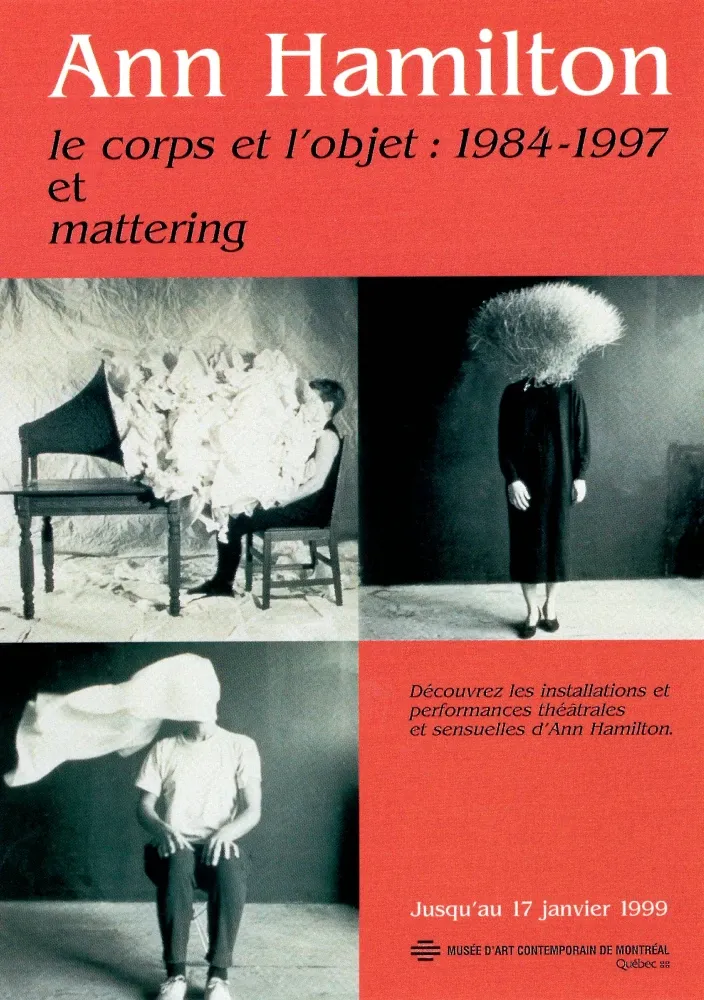
The Ann Hamilton postcard from her exhibition Le corps et l’objet: 1984–1997 feels like stillness made visible. Each image blends body, object, and silence — a quiet reminder that art often speaks most clearly when it refuses to explain itself.
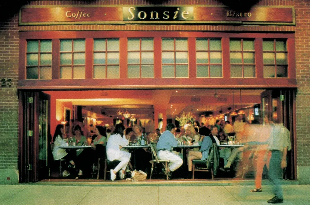
The Sonsie Café card glows with the warmth of city evenings — people gathered, conversations spilling out onto the sidewalk. It captures that familiar rhythm of motion and pause, where sound, laughter, and streetlight meet.
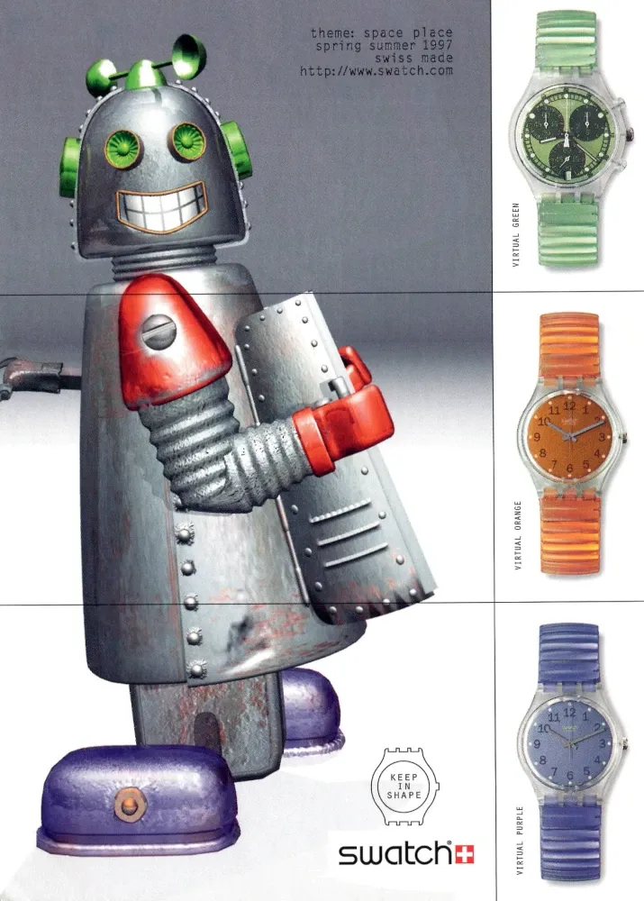
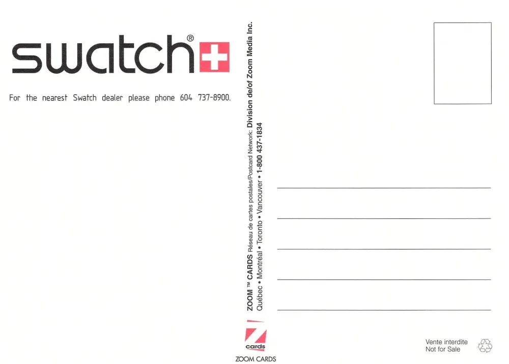
The Swatch “Space Place” card is pure optimism from the late nineties — a smiling robot and bright plastic futures. It’s design as play, when time itself felt like something you could customize.
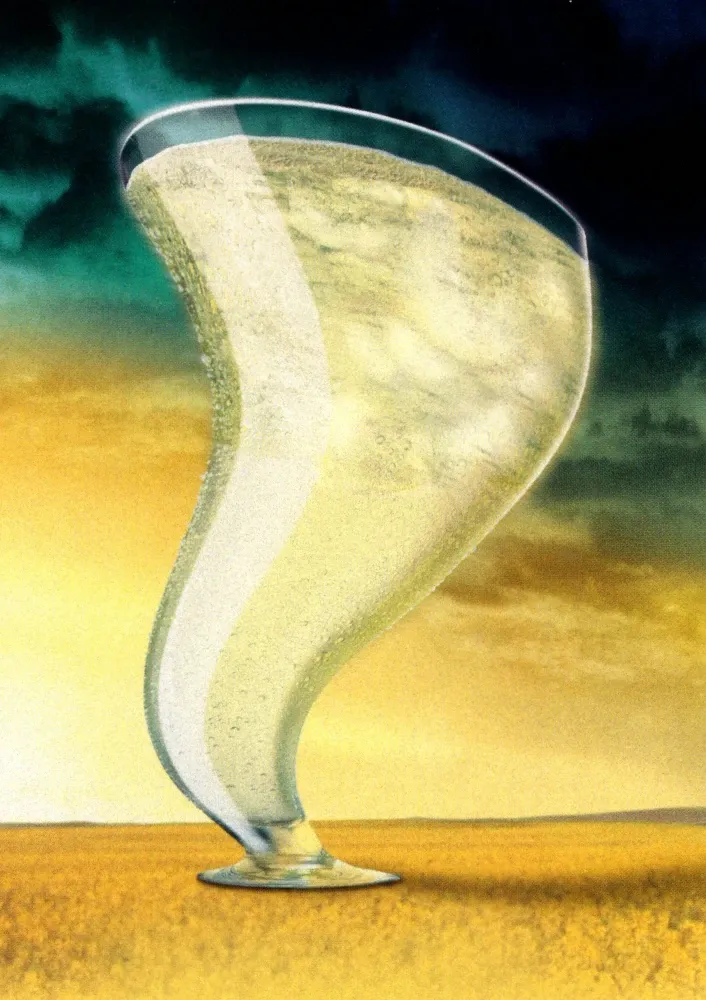
And the tilted champagne glass bends the rules of perspective, caught mid-twist between celebration and dream. It feels surreal and cinematic, like joy stretched just far enough to become art.
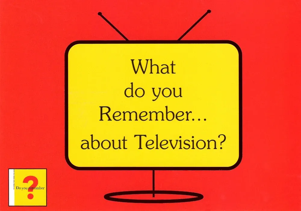
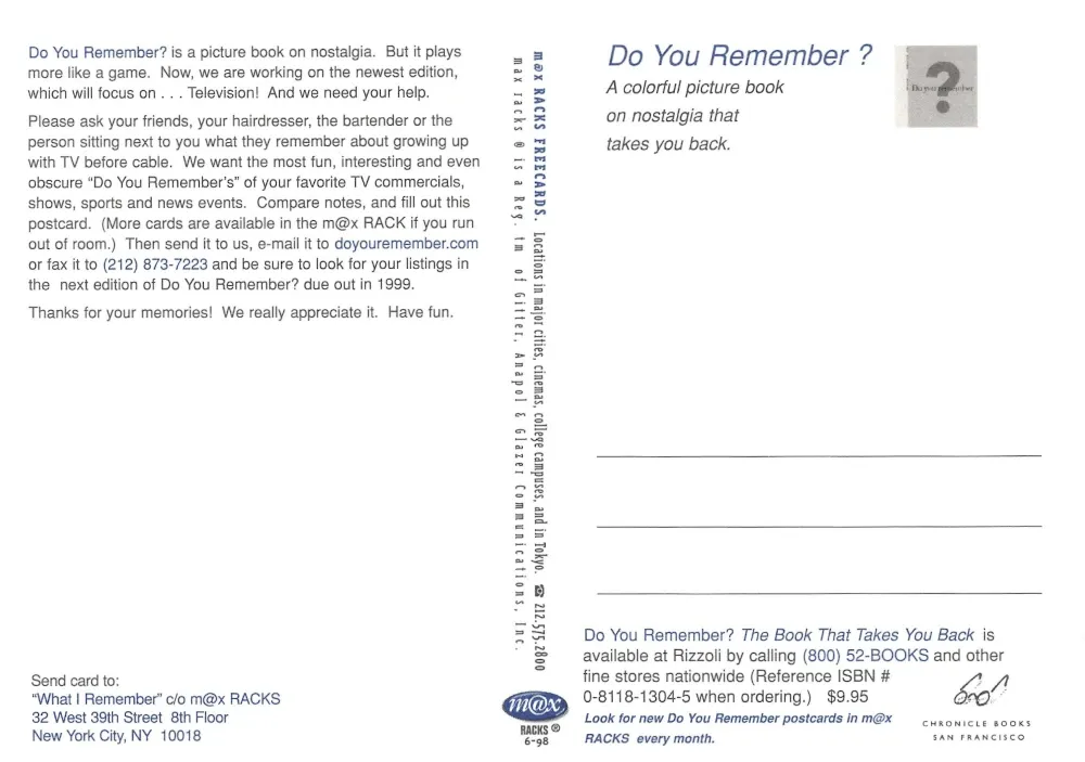
The “What do you remember about Television?” card feels like a time capsule question. It takes you back to static-filled screens, Saturday mornings, and the shared rhythm of a world that watched together. It’s nostalgia distilled to a single, honest pause.
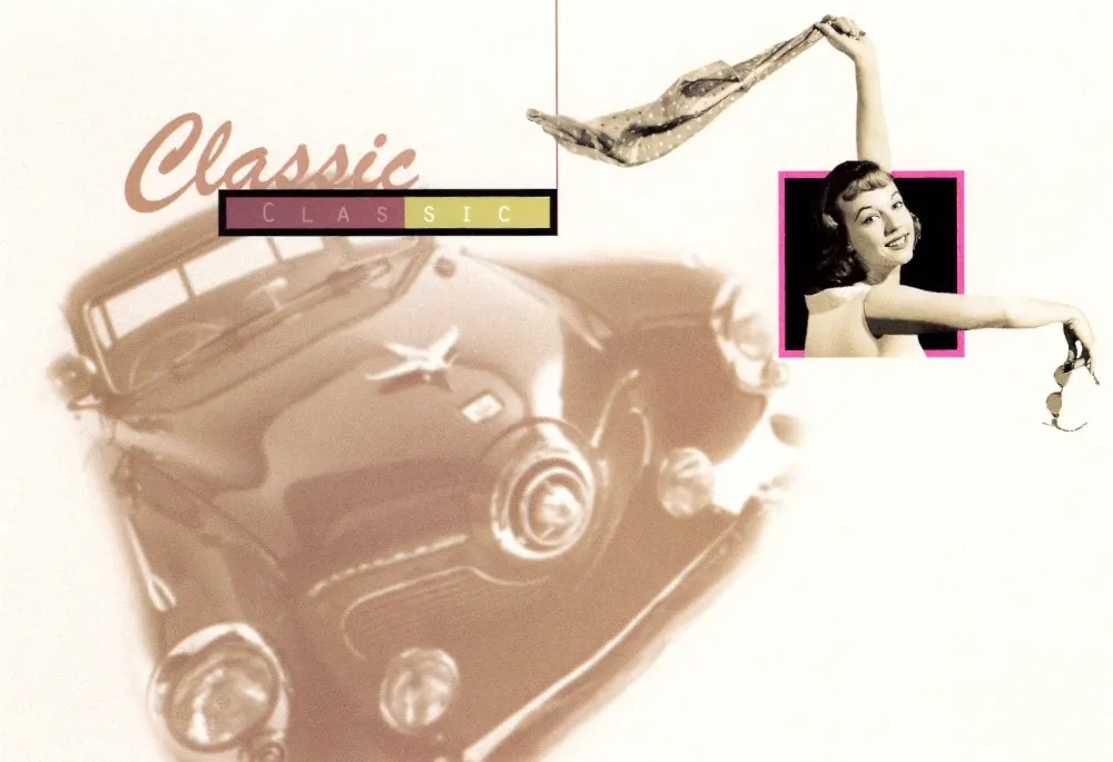
The Classic postcard shimmers with retro optimism — a car in motion, a scarf in the wind, and a promise that style never fades. It’s joy captured mid-century, reminding us that the open road once meant possibility itself.
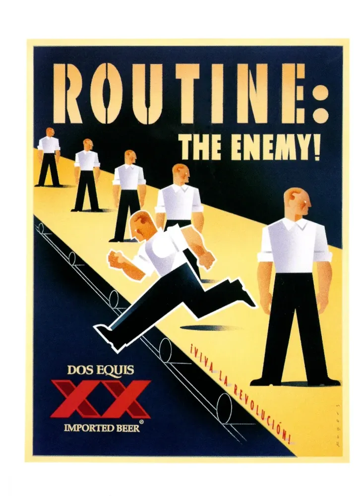
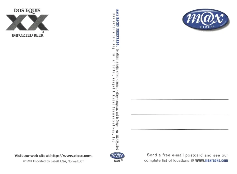
The Dos Equis “Routine: The Enemy!” card is bold and defiant, an anthem for every creative who refuses to settle. Its clean lines and mid-century confidence turn rebellion into design.
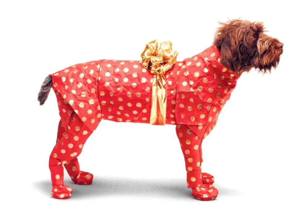
And the wrapped dog — red paper, gold ribbon, and patient eyes — is both absurd and sweet. It makes you smile, then think, reminding us that love often comes dressed in laughter.
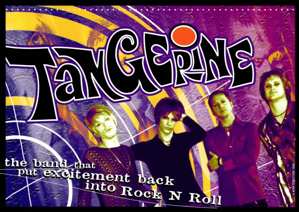
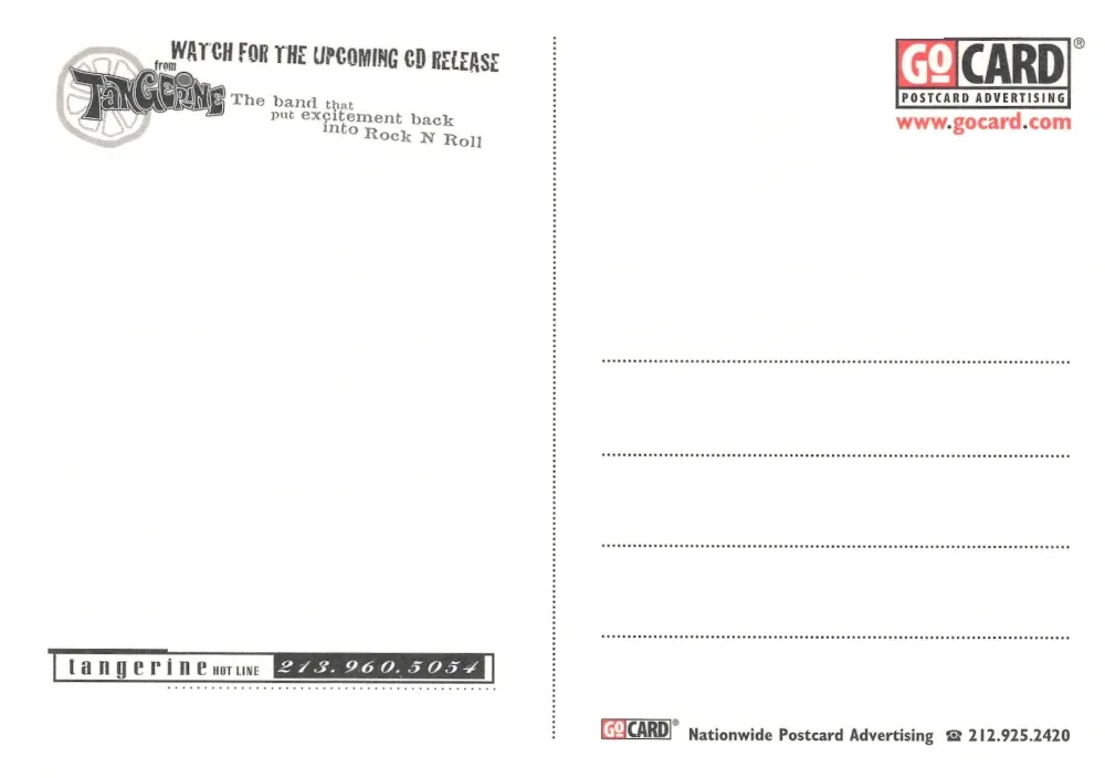
The Tangerine postcard bursts with color and swagger, its promise loud and unapologetic — “the band that put excitement back into rock ’n’ roll.” It feels like the late nineties distilled: bold typography, confidence without irony, and that familiar hunger to make something that still mattered.
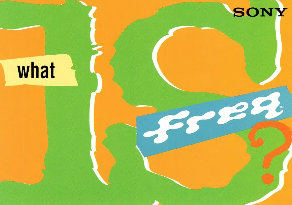
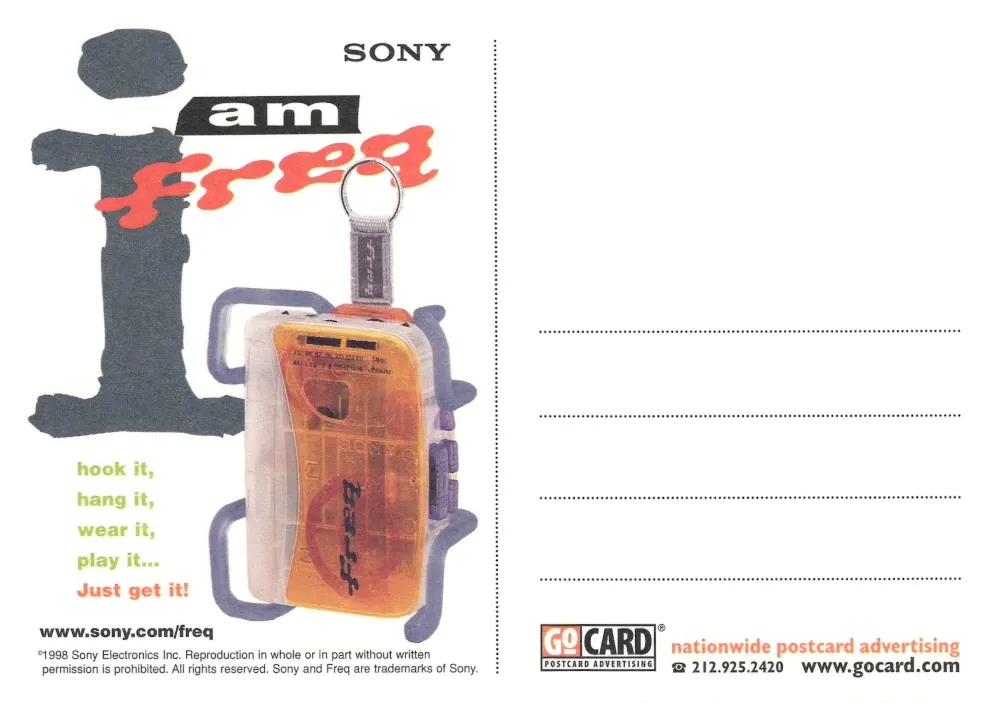
The Sony “What is Freq?” card is pure design-era curiosity, a snapshot of when branding tried to sound like philosophy. The shapes and colors collide like a question without an answer, reminding me of how technology once felt playful, still discovering its own voice.
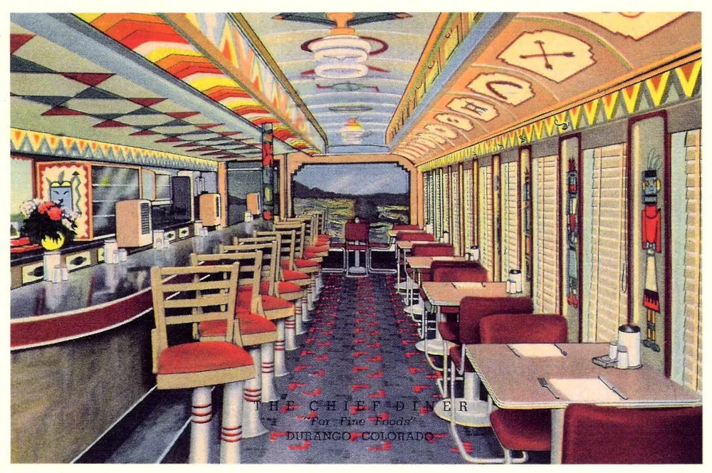
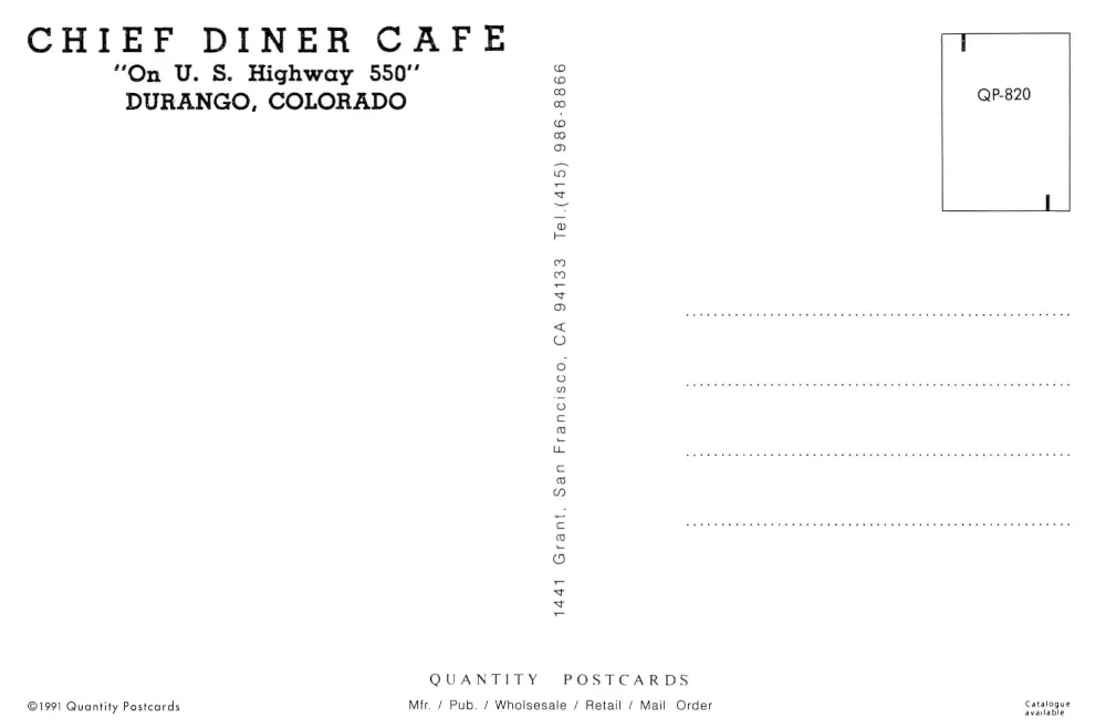
Then, a quiet contrast — the Chief Diner in Durango, Colorado. A perfect freeze-frame of Americana, all chrome edges and warm desert tones. It looks like the kind of place you’d stop on tour just to stretch, refill a coffee, and trade small talk with strangers you’ll never meet again.
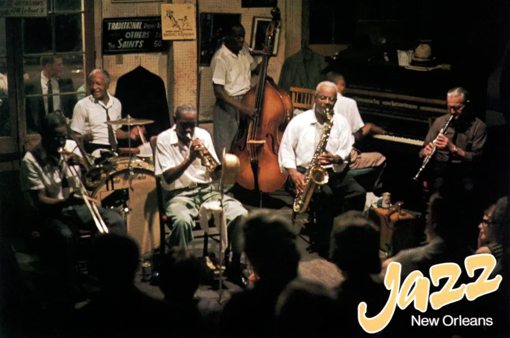
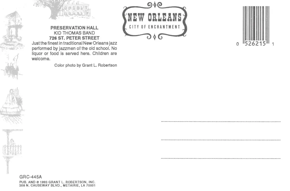
And finally, the New Orleans Jazz card, pulsing with the glow of real music. The air in that room must have been thick with rhythm and energy, every horn and handclap tracing the shape of the city’s heartbeat. It’s not nostalgia, it’s the sound that never fades.

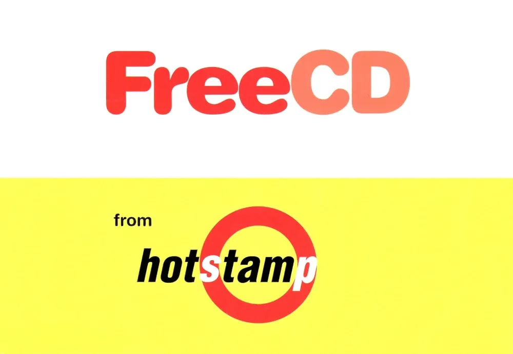
The Free CD postcard is a relic from the era when music came with a promise — a giveaway that felt like a golden ticket. Its bold colors and simple message recall the days when sound had weight, when discovery came sealed in plastic and excitement was something you could hold.
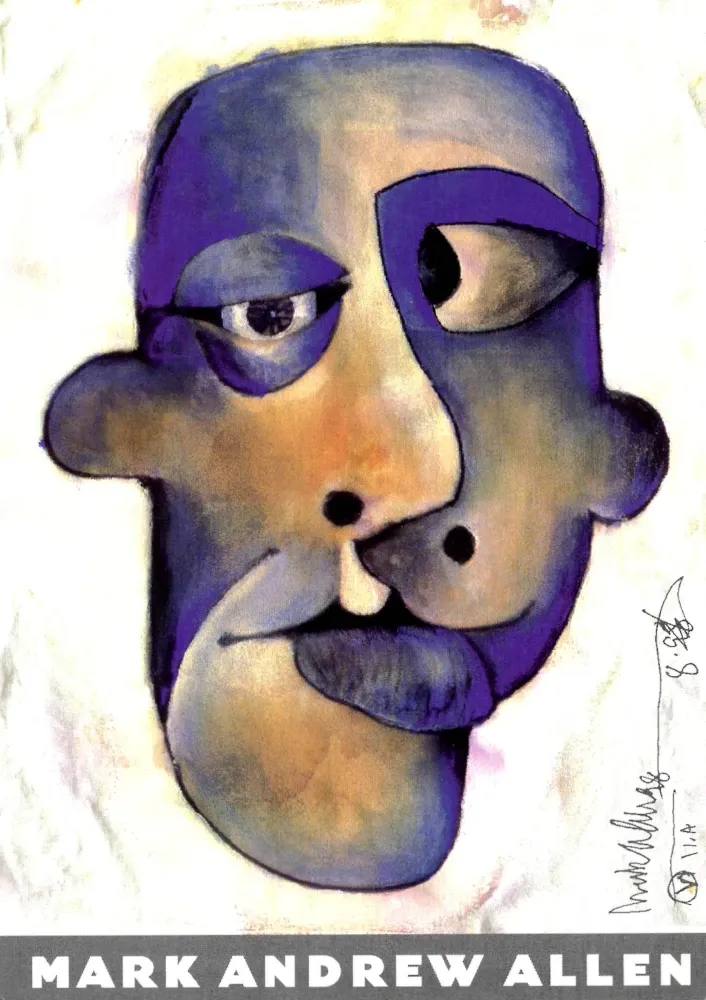
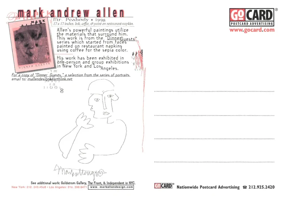
The Mark Andrew Allen card feels like the pause after all that noise. The face, abstract and human, looks both weary and curious. It’s art that asks quietly, What’s beneath all this design?
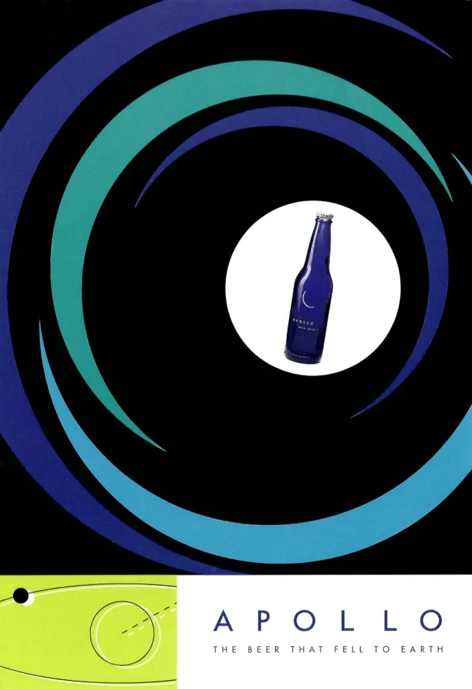
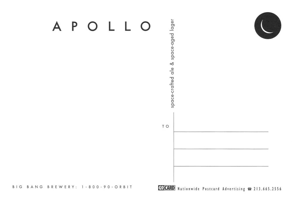
Then comes the Apollo Beer postcard, minimalist and space-age sleek — “The beer that fell to earth.” It feels like a wink to the future, a reminder that even the most commercial designs once dreamed of orbit.
There are more postcards being cleaned up and I should have them done and added in a couple more articles. I hope you enjoy these memories of art, design, and atmosphere from a decade that still has so much to say.
Volume I
Volume II
Volume IV