
Postcards From The Road: Volume Five
Volume Five adds another cross section of 1990s postcard culture, the kind that lived in free racks at clubs, record stores, cafés, and lobbies, and then traveled in pockets, instrument cases, backpacks, and glove compartments. These cards show how the era advertised in public spaces, with images designed to stop someone at a rack, and functioned like evidence, names, addresses, phone numbers, dates, and short explanations that told the viewer what the image was actually selling.
Across this volume area steady movement between music and place, from venue and lounge promotions, to record store and label culture, to campaigns that used postcards as miniature billboards. Some cards lean on photography and art credit lines, some function as event invitations with precise dates and locations, and others are early internet artifacts where a web address was marketed like a destination, a guide, or a new kind of city service.
What makes the collection feel interesting is the mix of the personal and the commercial, a train station photograph placed next to a beer concept, a candy campaign next to an album promotion, and a city launch invite sitting in the same ecosystem as underground music and fashion retail. The consistent thread is distribution, these were designed to be taken, not treasured, and that everyday intention is what turns them into a clean snapshot of how the road felt when information still traveled on paper.
Bimbo’s 365 Club, San Francisco, California
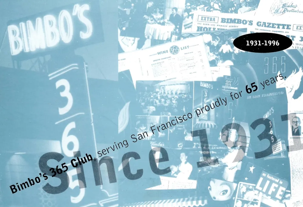
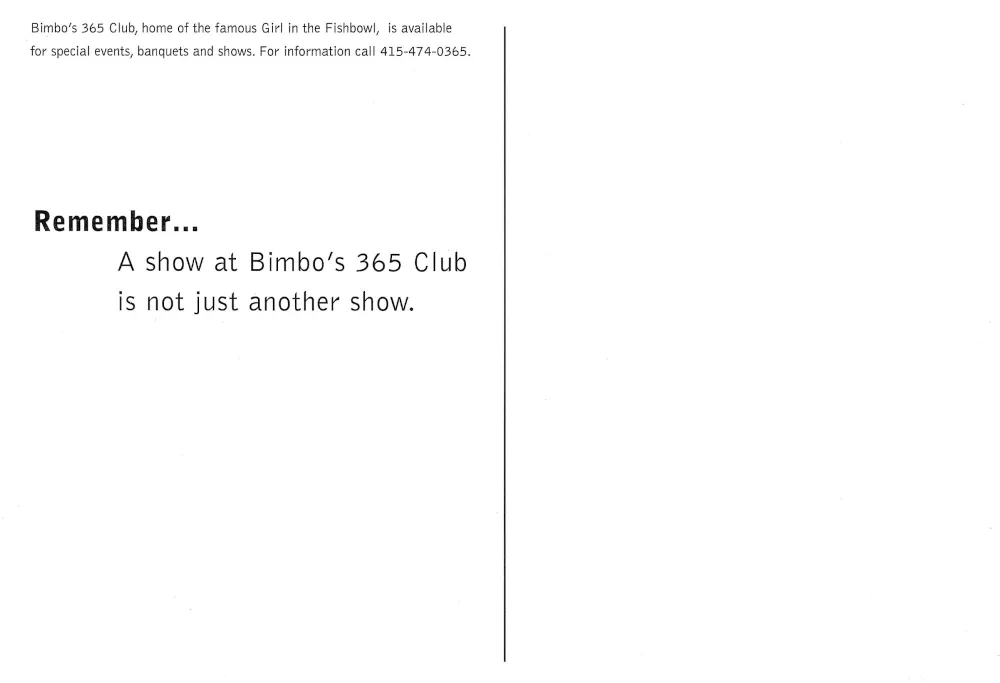
This postcard promotes Bimbo’s 365 Club through a collage style design that emphasizes the venue’s identity and longevity rather than a single exterior photograph, with the printed “1931 to 1996” reinforcing the sense of history. The reverse frames the venue experience with the line, “Remember. A show at Bimbo’s 365 Club is not just another show,” and references the club’s long associated “Girl in the Fishbowl” act, a signature illusion that has been documented as part of Bimbo’s North Beach lore for decades.
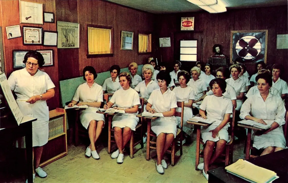
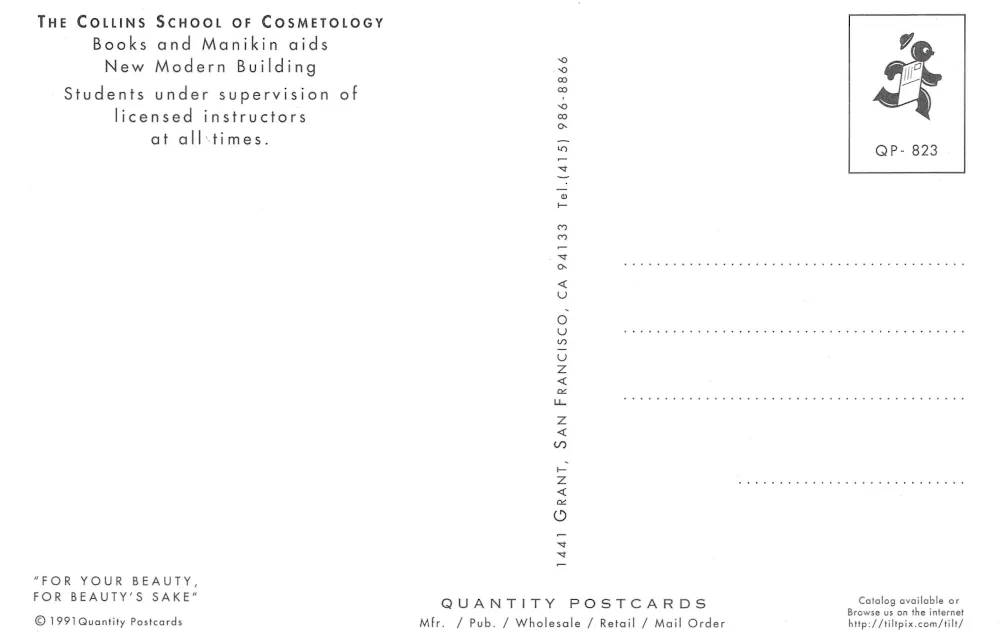
The Collins School of Cosmetology, San Francisco, California
The front shows a cosmetology classroom scene, while the back provides the concrete identifiers that place the card as a catalog style item: a Quantity Postcards marking, a QP number, and a 1991 copyright line, plus the school’s Grant Avenue address and a local phone number. The reverse copy stays practical, describing training materials and supervised instruction, which reads more like an informational credential statement than a tourist message, and it aligns with Quantity Postcards being a large postcard operation based in Oakland.
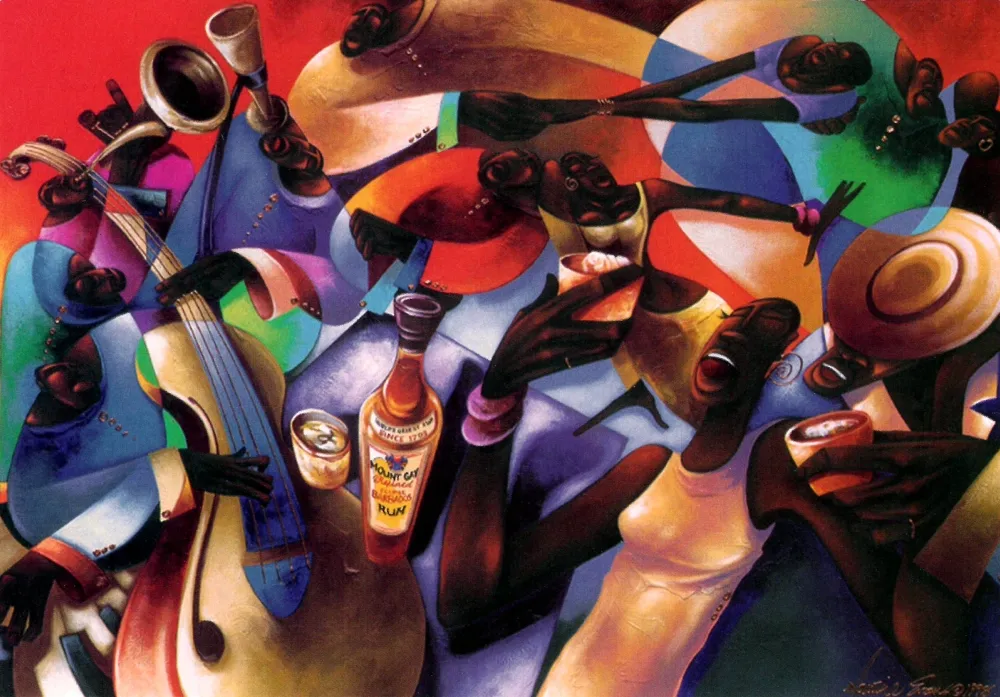
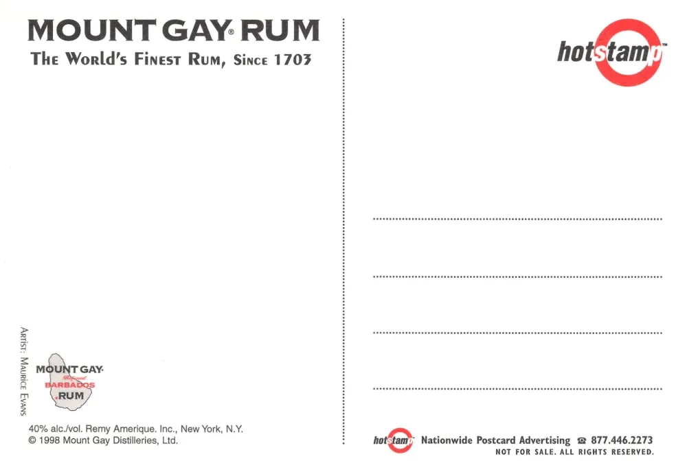
Mount Gay Rum promotional art card, artwork by Maurice Evans
This postcard uses illustrated jazz imagery to set a mood, with the Mount Gay bottle placed inside a crowded music and dance scene rather than featured as a standalone product shot. The reverse confirms it is advertising, marked not for sale, and credits the artist Maurice Evans with a 1998 copyright line tied to the brand, which fits Evans’ broader body of work being strongly influenced by music and jazz themed visual storytelling.
Heritages Art
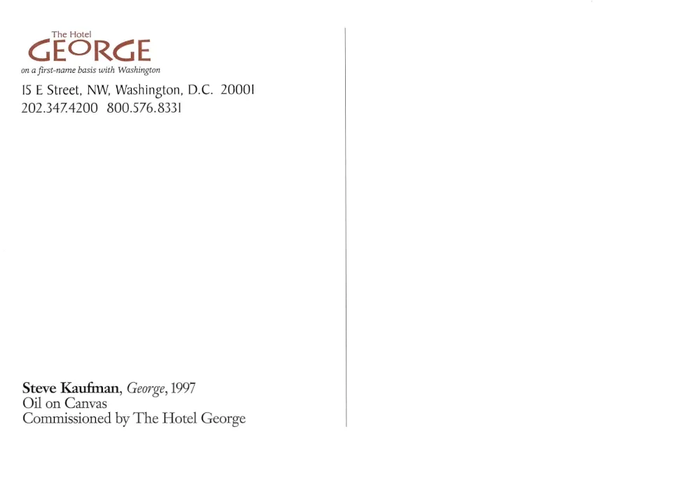
The Hotel George, Washington, District of Columbia, Steve Kaufman “George,” 1997
This hotel branded postcard presents commissioned artwork as the subject, with the reverse crediting Steve Kaufman’s “George,” 1997, oil on canvas, and listing The Hotel George address at 15 E Street NW in Washington, DC with phone numbers that match the hotel’s published contacts. The imagery connects to how the property has been described by travel reviewers and the hotel itself, where portraits of George Washington by Kaufman function as a visible part of the hotel’s design identity, making the postcard a portable version of the lobby experience rather than a simple souvenir view card.

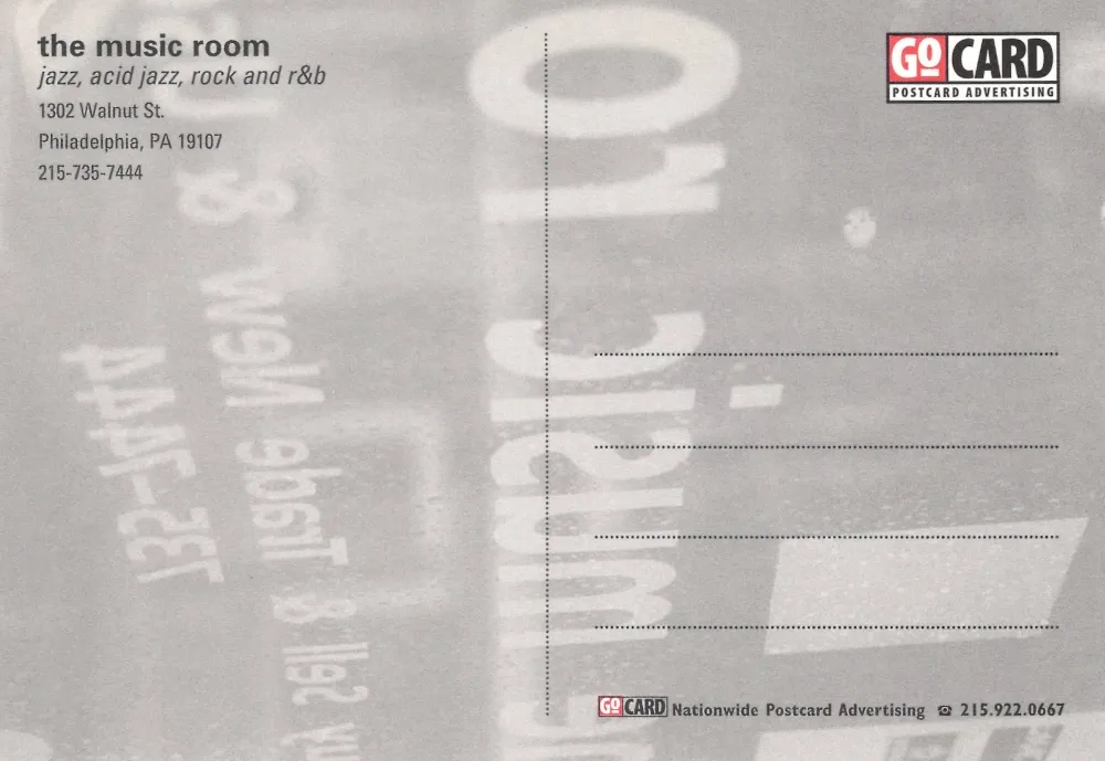
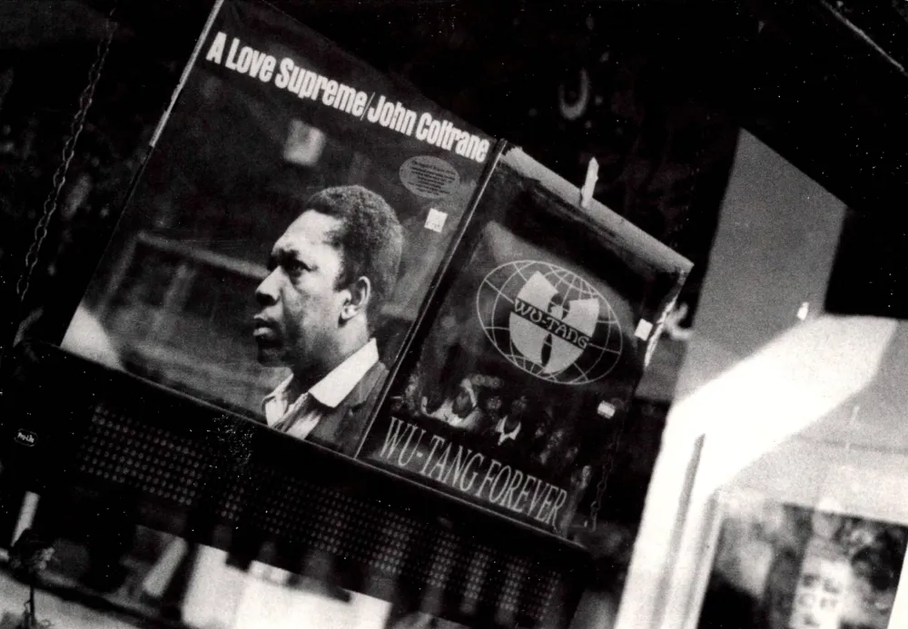
The Music Room, Philadelphia, Pennsylvania
The front uses a gritty black and white photo of record store culture, with John Coltrane’s A Love Supreme and the Wu Tang album Wu Tang Forever visible in the display, an image choice that signals taste and scene rather than showing a stage or a storefront. The reverse identifies the sponsor as “the music room,” lists genres (jazz, acid jazz, rock and R and B), and provides the venue’s Walnut Street address in Philadelphia along with a local phone number, all branded through GoCard postcard advertising. This is a strong example of how many 1990s promotional postcards functioned as miniature flyers, distributed in nightlife racks and intended to be kept as a pocket reference, not mailed. MFA Collections
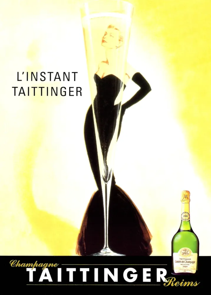
L’Instant Taittinger, GoCard
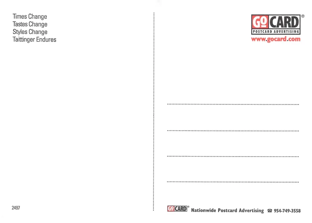
This postcard is built from a classic French champagne poster concept, a tall flute rendered like a full length silhouette, with a glamorous figure framed inside it, and the words “L’Instant Taittinger” set cleanly against a warm field of color. The reverse reads like a brand positioning statement rather than an invitation, “Times Change, Tastes Change, Styles Change, Taittinger Endures,” and it carries GoCard distribution marks, reflecting the era when premium brands used free postcard racks as mass placement in bars, cafés, and music venues. The image is widely associated with actress Catherine Deneuve in poster catalog descriptions, which helps place the look and intent of the design even when the card itself is cropped and simplified for postcard format. The Ross Art Group
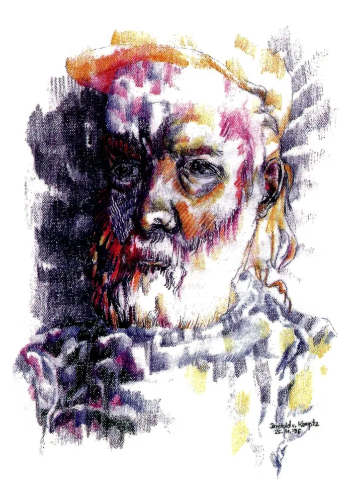
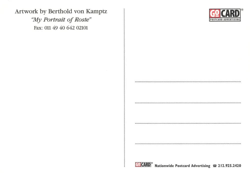
“My Portrait of Roste,” Berthold von Kamptz, GoCard
The front is a painterly, mixed media portrait of an older man with a white beard, rendered in layered color and textured shadow, with a handwritten artist signature and a dated notation that reads as mid 1990s. The reverse confirms it as an art distribution card, crediting Berthold von Kamptz and the title “My Portrait of Roste,” and it includes an international fax number, a detail that anchors the piece firmly in its period. In the GoCard ecosystem, this kind of card sits at the intersection of gallery promotion and street level exposure, an affordable way for an artist’s image and name to travel through the same racks that carried club and brand advertising. ArtMajeur Online Art Gallery
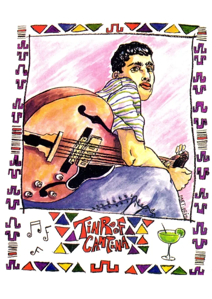
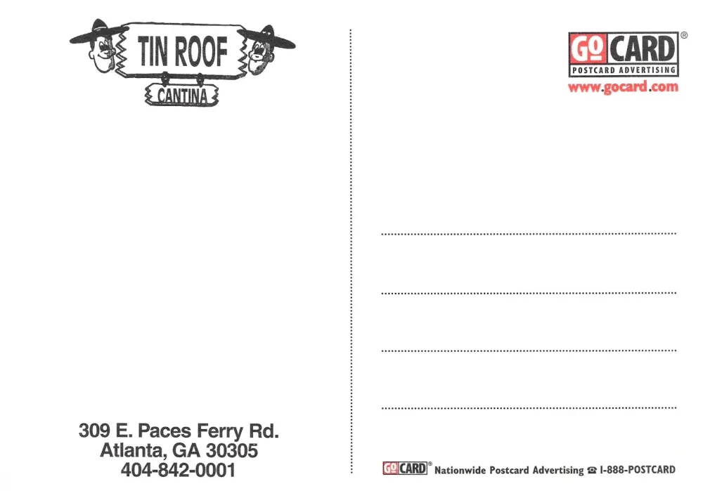
Tin Roof Cantina, Atlanta, Georgia, GoCard
This postcard presents Tin Roof Cantina through a lively illustration of a guitarist framed by colorful border motifs and small icons of music and cocktails, visually communicating that the venue is as much about atmosphere as it is about food and drink. The reverse keeps things utilitarian, giving the Atlanta address on Paces Ferry Road and a local phone number, with GoCard branding that matches the broader 1990s practice of turning postcards into compact venue directories. As a tour artifact, it reads like a snapshot of how nightlife once advertised before social media, with a strong graphic front to catch attention and a plain back that functions as the saved reference.
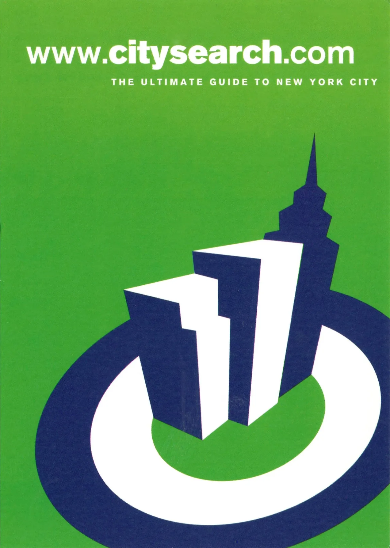
CitySearch, “The Ultimate Guide to New York City”
The front is a bold, minimal CitySearch advertisement, presenting the website as “the ultimate guide to New York City,” with a stylized skyline emerging from a power button graphic, which captures the late 1990s idea of the internet as the new on switch for local knowledge. The back reinforces that positioning with the CitySearch URL, the claim “Over 8,000 listings daily,” and a 1997 copyright line, packaged in the GoCard postcard advertising format, which places it firmly in the era of free rack distribution where a website could be marketed like a venue or a magazine.
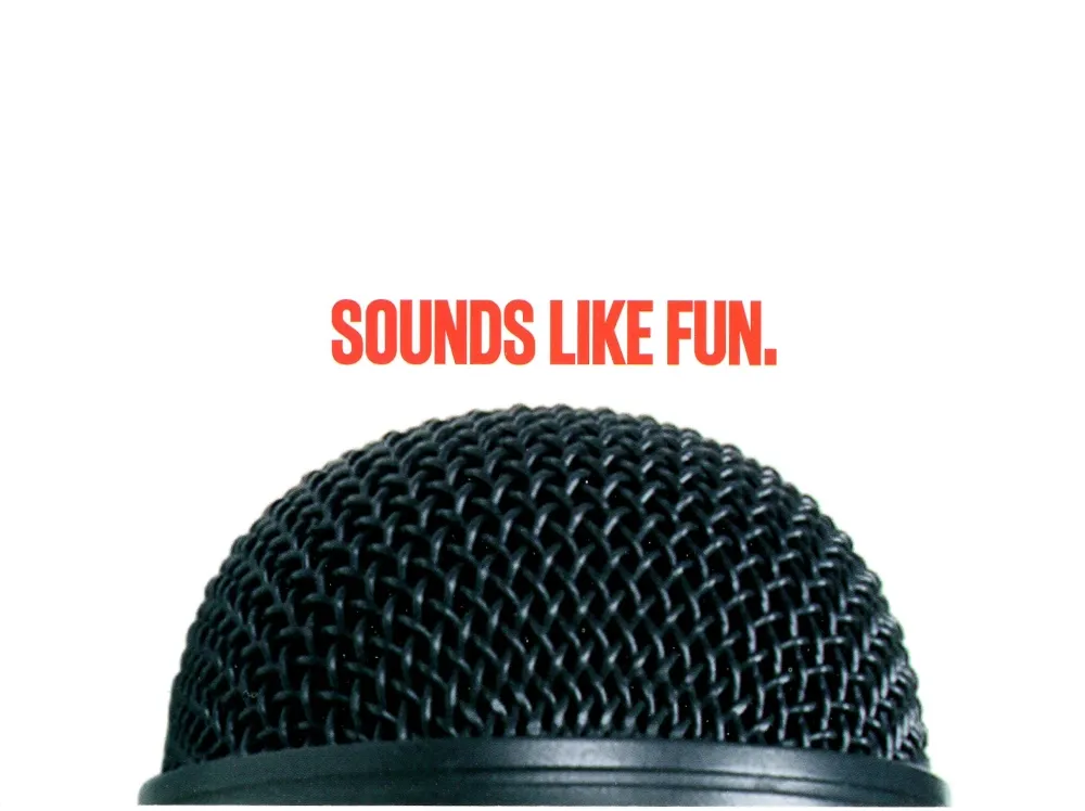
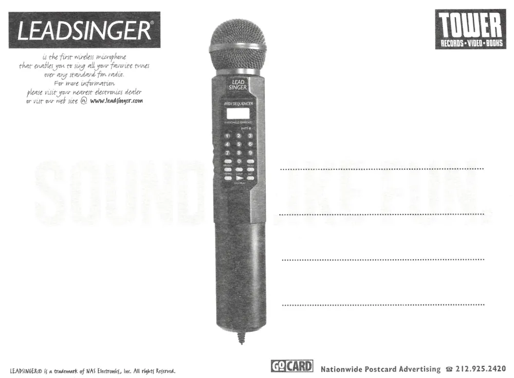
LeadSinger wireless microphone, “Sounds Like Fun”
The front keeps it simple, a close up microphone head and the line “SOUNDS LIKE FUN,” using the most recognizable symbol of singing to sell the concept in a single glance. The back reveals what is being advertised: LeadSinger, described here as a wireless microphone that enables the user to sing along with favorite tunes over any standard FM radio, and it also ties into music retail culture by carrying Tower Records branding, along with the GoCard distribution marks and a website reference for more information.
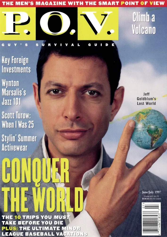
P.O.V. magazine, June July 1997
The front reproduces a P.O.V. cover featuring Jeff Goldblum with the issue date June July 1997, positioned as a smart, aspirational men’s magazine with travel, culture, and lifestyle hooks layered across the cover. The reverse reads like a compact mission statement under the headline “LIVE LARGE,” describing the magazine’s focus on taking control and being your own boss, then directing the reader to subscribe via a phone number and a website, again using the GoCard format to turn a magazine promotion into something that could live in a wallet like a mini poster.
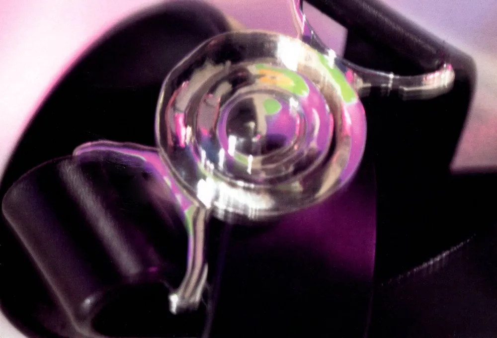
Russ Regal Designs NYC, “piknik”
The front is an abstract, close up photograph of a reflective ring like object under purple lighting, leaning into texture and mood rather than showing a product directly, which is a common style for fashion and accessory promotions from this period. The back identifies the sponsor as Russ Regal Designs NYC, advertising silver, gold, and platinum accessories for men and women, and it credits the image to NYC photographer Maria Ferrari, with phone numbers for both the designer and the photographer, plus “piknik” and GoCard distribution marks and a “not for sale” statement, all of which frames this card as a curated ad piece meant to be collected rather than mailed.
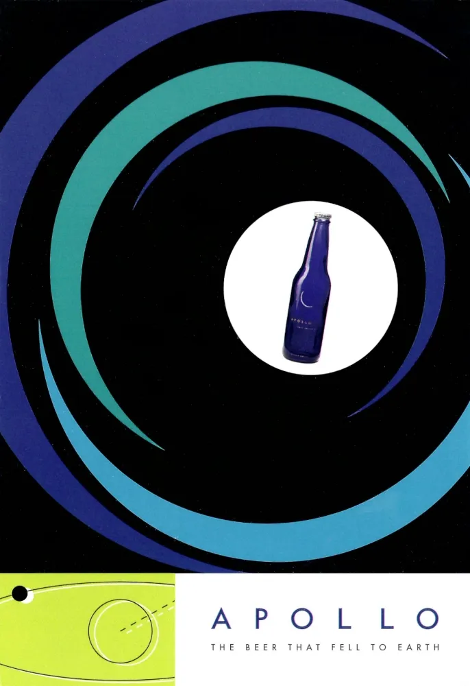


Apollo beer, Big Bang Brewery, “The beer that fell to earth”
This postcard sells Apollo beer through space themed graphic design, using a deep spiral motif that pulls the eye into a small blue bottle at the center, with the tagline “The beer that fell to earth” printed below. The back keeps the branding clean and minimal, labeling it as “space crafted ale and space aged lager,” adding a toll free number for Big Bang Brewery, and carrying GoCard distribution marks, which places it in the same 1990s free rack ecosystem as many nightlife and beverage promotions.
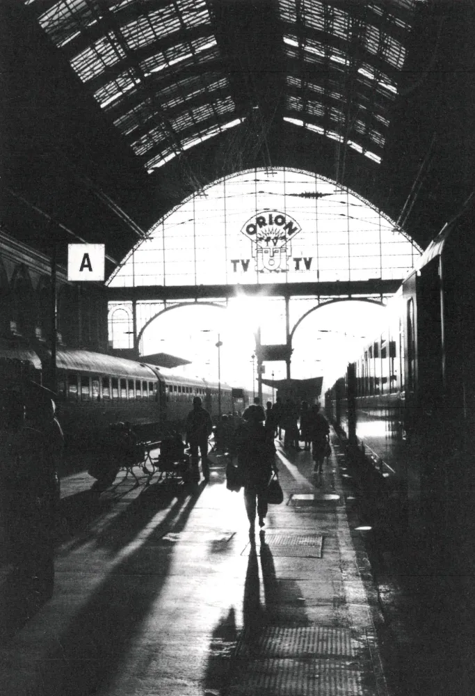
“The Budapest Train Station,” 1994, photo by Nick Coleman
The front is a high contrast black and white photograph of a large train station interior, with long shadows and silhouetted travelers, giving the image an unmistakable transit mood that fits the Postcards From The Road theme even without any caption on the front. The reverse identifies the work directly, “The Budapest Train Station,” 1994, with credit to photographer Nick Coleman and a phone number, plus the GoCard imprint, which suggests this was distributed as an art or portfolio promotion as much as a travel souvenir.
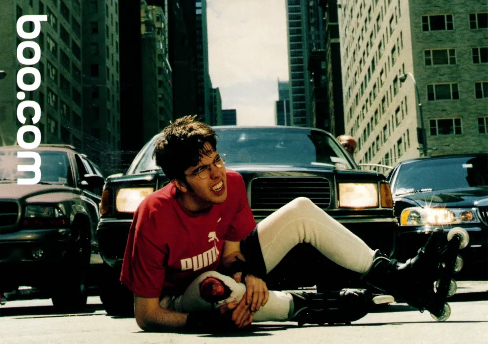
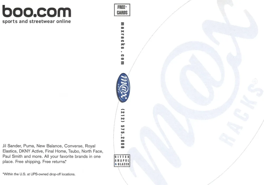
Boo.com, sports and streetwear online retailer
A side note: I met with this company in England and presented a demo of music and audio to use on their website. At this time of the internet, audio on websites was very rare due to the low bandwidth. Also people were not purchasing clothes online yet. This Boo.com card presents a staged streetwear scene that looks like a late 1990s fashion editorial, with the Boo.com branding running vertically and an action heavy composition designed to grab attention in a postcard rack. The reverse makes the business model explicit, describing Boo.com as an online place to get sportswear and streetwear, listing major apparel brands, and pointing to “maxracks.com” while carrying GoCard advertising marks, which is consistent with how early online retail brands bought physical visibility through nightlife distribution channels.
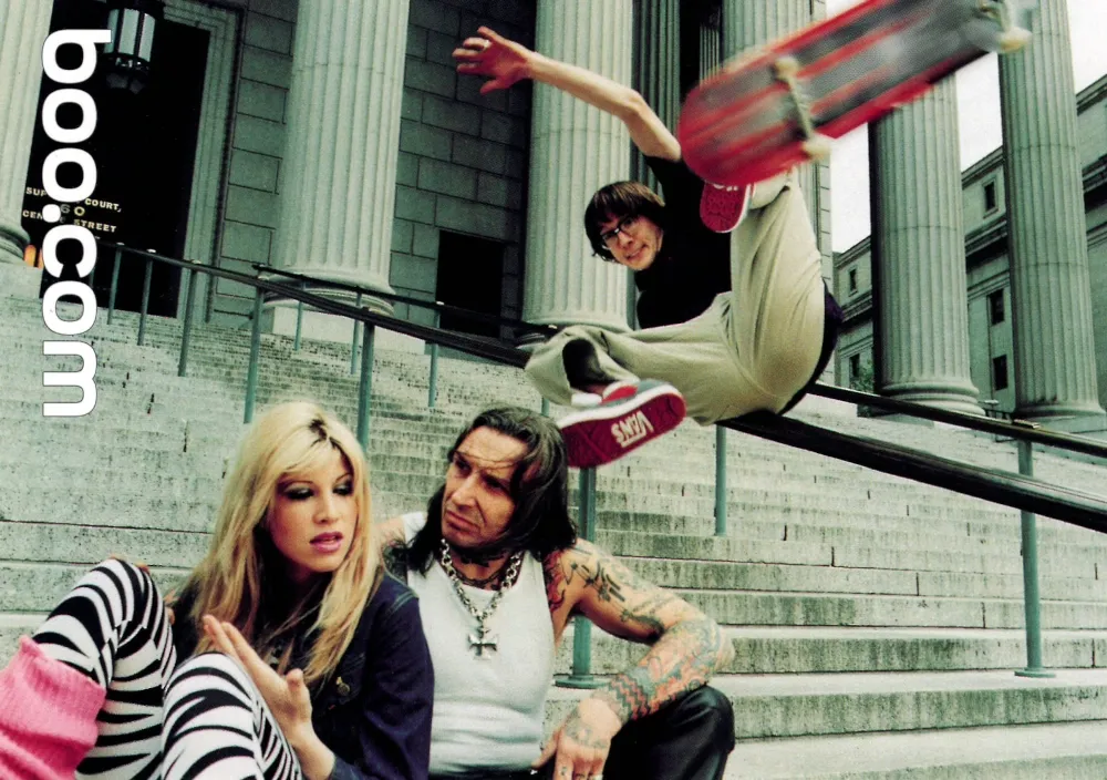
Boo.com, sports and streetwear online retailer
The second Boo.com card uses a different staged image, a skateboarder in midair on courthouse steps, framed by seated onlookers and the vertical Boo.com branding, again leaning on action and attitude rather than product detail. The reverse mirrors the first card’s informational approach, describing Boo.com as a destination for the latest activewear, footwear, and swimwear, and noting that it pairs shopping with content and culture, all presented through the GoCard postcard advertising format that served as a pre social media marketing channel for early web brands.
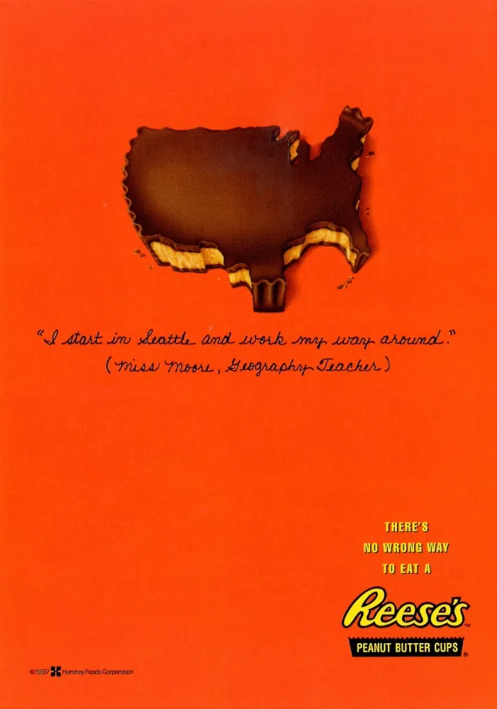
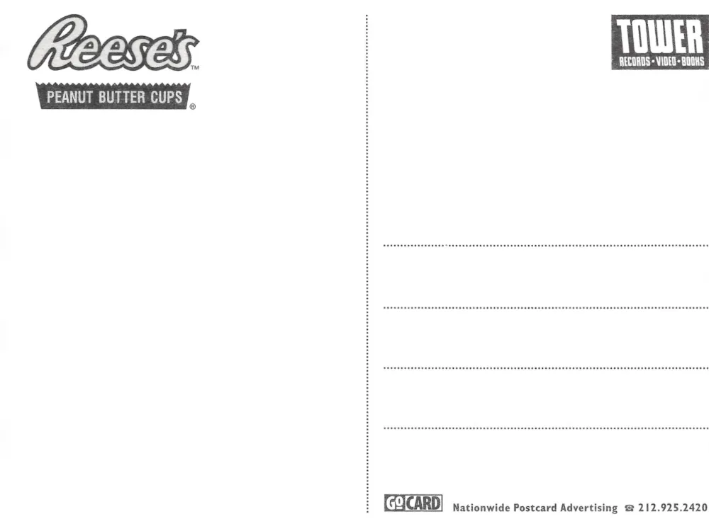
Reese’s Peanut Butter Cups, “I start in Seattle and work my way around”
This Reese’s card uses a bitten peanut butter cup shaped like the United States map as the visual joke, paired with the handwritten style quote, “I start in Seattle and work my way around,” attributed to “Miss Moore, Geography Teacher,” and anchored by the campaign line, “There’s no wrong way to eat a Reese’s.” The reverse is clean and distribution focused, showing the Reese’s branding with GoCard postcard advertising marks, and it also notes “As seen in US,” which reinforces that this was part of a wider 1997 era promotional push that traveled across print, retail racks, and these free postcard displays.
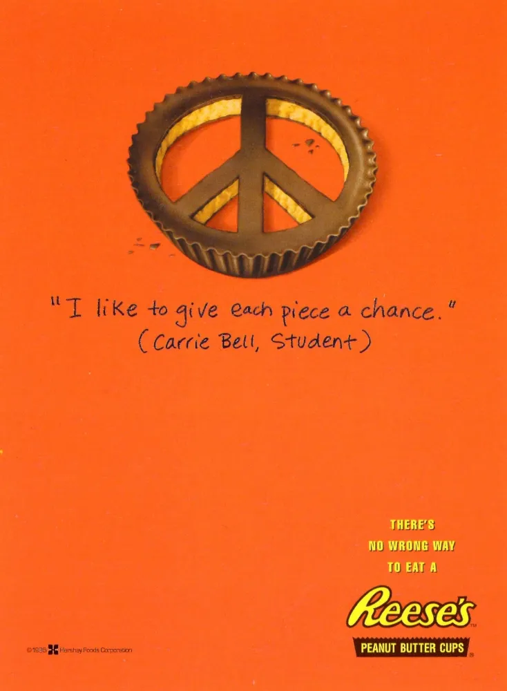
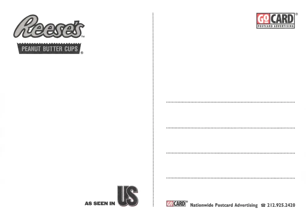
Reese’s Peanut Butter Cups, “I like to give each piece a chance”
The second Reese’s card continues the same campaign approach, this time shaping the peanut butter cup into a peace sign and pairing it with the quote, “I like to give each piece a chance,” attributed to “Carrie Bell, Student,” again under the line, “There’s no wrong way to eat a Reese’s.” The reverse repeats the Reese’s branding and GoCard distribution format, and it adds Tower Records branding, which is a clear indicator of where these cards were intended to live, in the same retail and music culture racks where people picked up event cards, magazine cards, and product promos as part of the 1990s public space advertising ecosystem.
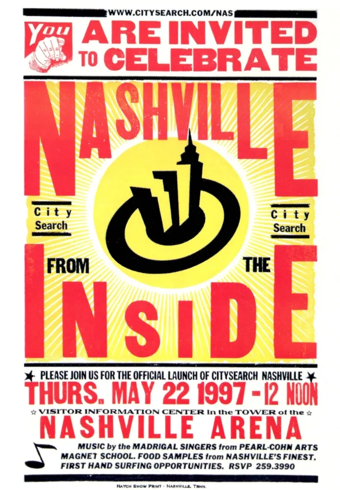
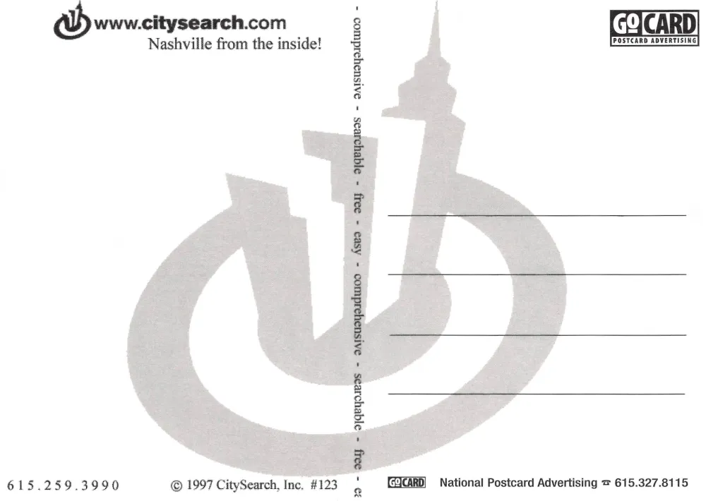
CitySearch Nashville launch invitation, May 22, 1997
This CitySearch card is a direct event invitation, with bold poster style typography announcing “You are invited to celebrate Nashville from the inside,” and it specifies the official CitySearch Nashville launch as Thursday, May 22, 1997 at 12 noon, located at the Visitor Information Center in the tower of the Nashville Arena. The details read like a community facing rollout, listing music by the Madrigal Singers from Pearl Cohn Arts Magnet School, food samples, first hand surfing opportunities, and an RSVP phone number, while the reverse carries CitySearch Nashville branding, GoCard postcard advertising marks, and the “Nashville from the inside” positioning that CitySearch used to introduce itself as a practical city guide rather than a generic directory.
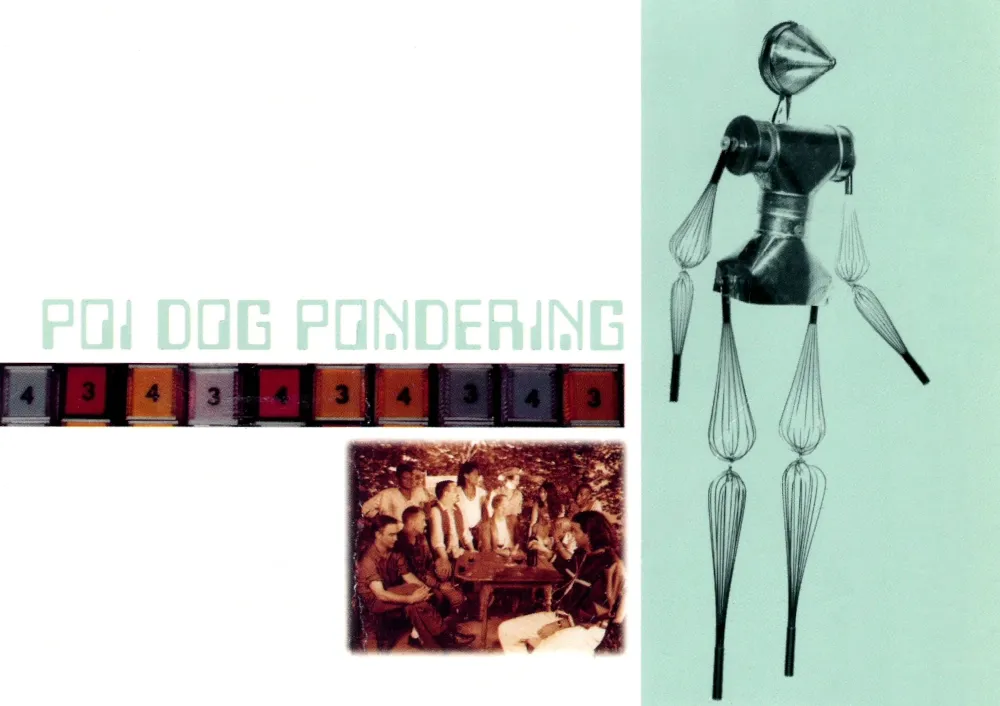
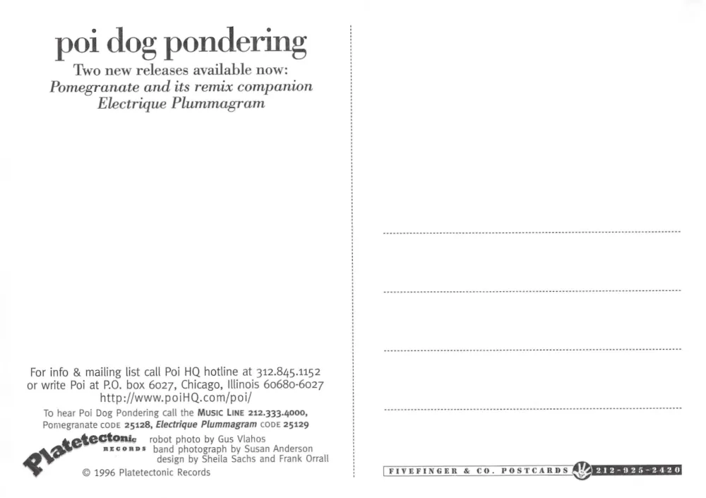
Poi Dog Pondering, new releases promotion, Platetetonic Records
This postcard promotes Poi Dog Pondering with a collage style front that feels like a period album insert, including band imagery, a stylized figure, and the group name as the dominant header. The reverse makes the purpose explicit, announcing two releases, “Pomegranate” and its remix companion “Electrique Plummagram,” and it provides a hotline number, a Chicago mailing address, and a website reference, plus a Music Line number with codes for each release, along with credits for robot photo, band photograph, and design, all under a 1996 Platetetonic Records copyright line that frames the postcard as a structured label side marketing piece rather than a casual souvenir.
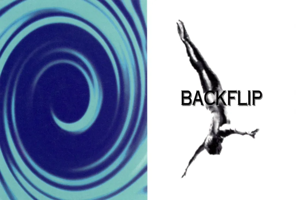
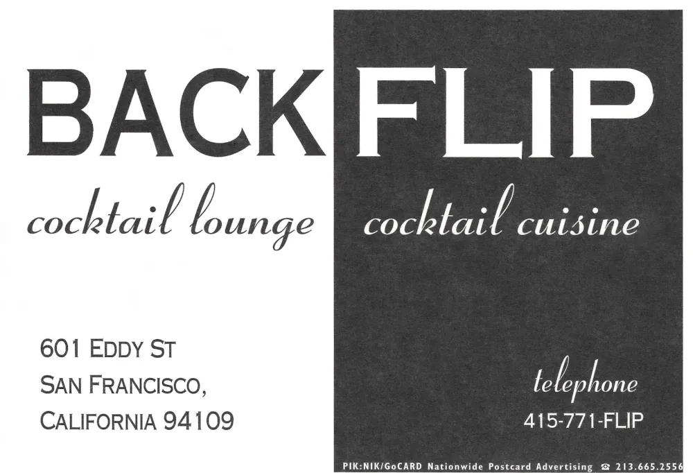

Backflip, San Francisco
The front pairs a cool blue spiral graphic with a diver mid motion and the word Backflip, a clean piece of nightlife design that suggests energy without showing a room or a crowd. The back completes the picture and makes it practical, identifying Backflip as a cocktail lounge and cocktail cuisine spot at 601 Eddy Street in San Francisco, with the phone number 415 771 FLIP, and the familiar Piknik and GoCard distribution marks that place it in the 1990s postcard rack world.
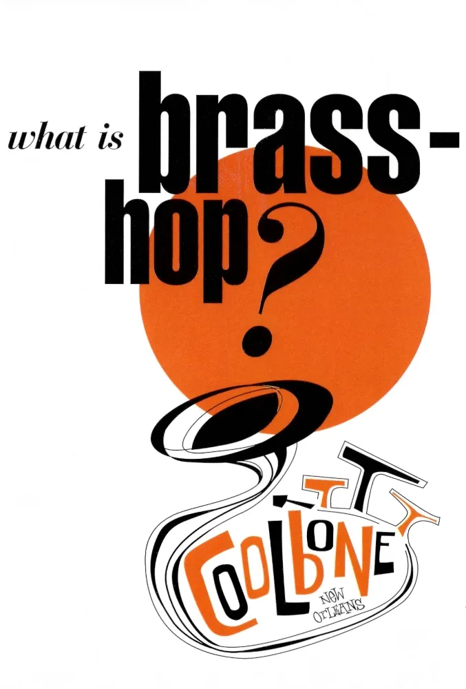
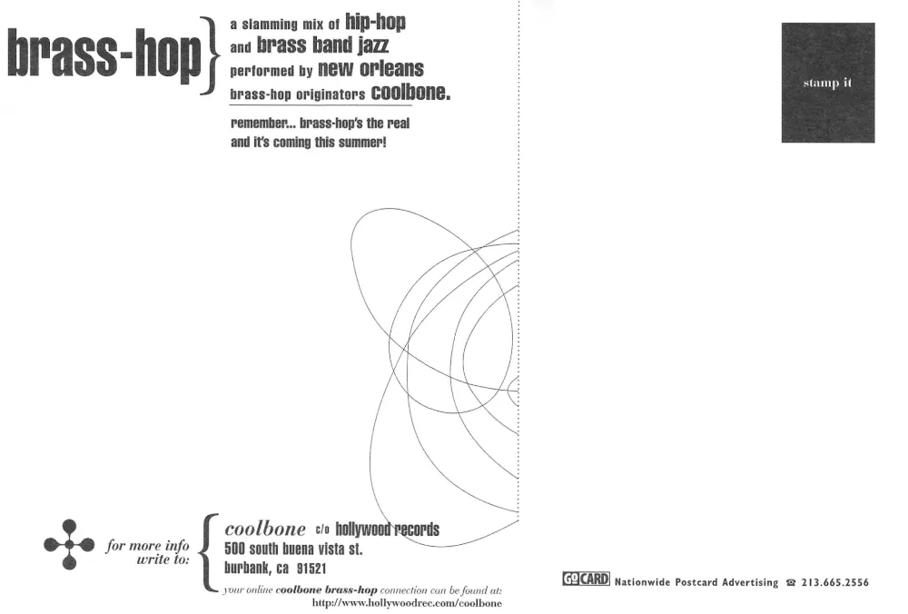
What is brass hop, Coolbone, New Orleans
The front is a direct question, “what is brass hop,” with the Coolbone name placed like a stamp of origin and “New Orleans” attached, framing the card as both a genre pitch and a band identity piece. The back answers the question in plain terms, describing brass hop as a mix of hip hop and brass band jazz performed by New Orleans originators Coolbone, and it points to Hollywood Records for contact in Burbank, along with an early web address for more information, all laid out like a compact press sheet meant to be grabbed, read, and kept.
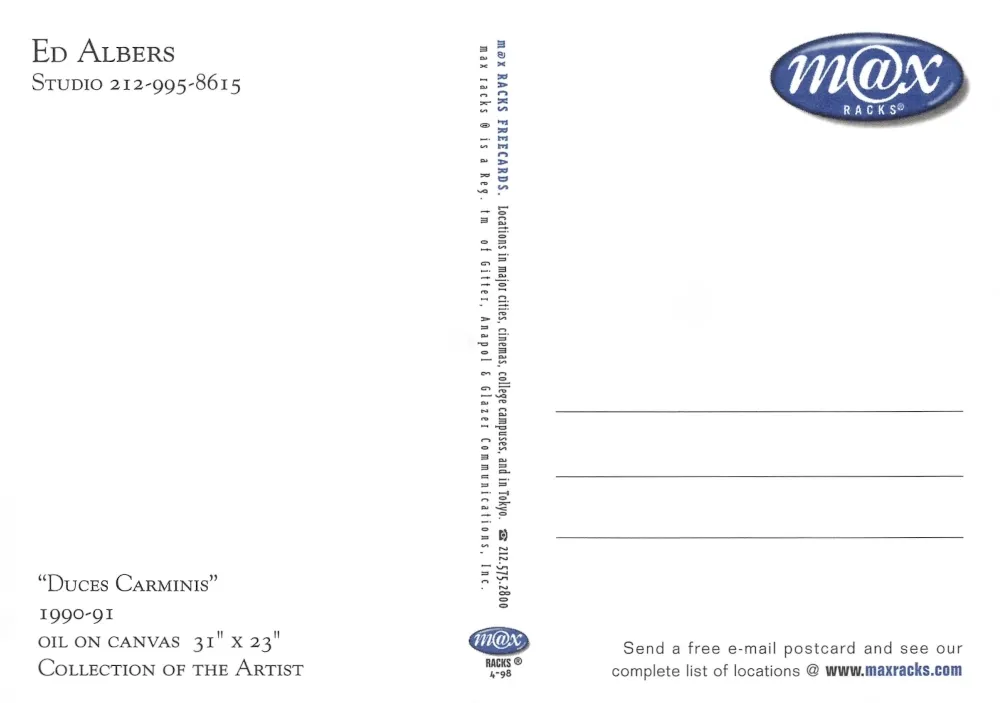
Duces Carminis, Ed Albers
The front is a quiet, minimalist image, a pale green field with a ribbon like form floating across it, and a few small seed like shapes suspended nearby, which reads more like a gallery print than an advertisement. The back identifies it as “Duces Carminis,” dated 1990 and 1991, oil on canvas, with dimensions listed, and it names Ed Albers with a studio phone number, while also carrying the Max Racks branding that shows how fine art imagery circulated right alongside clubs, labels, and brands in the same free postcard distribution network.
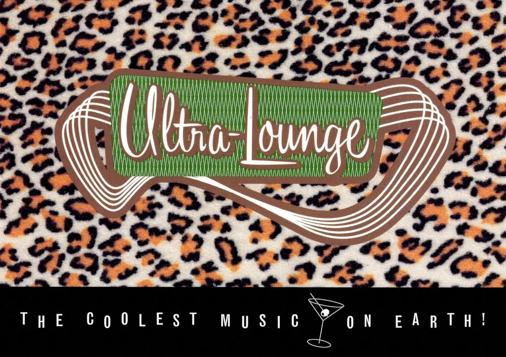
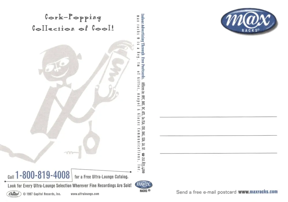
Ultra Lounge, “The coolest music on earth”
Ultra Lounge was the record label with Capitol Records that our band was signed to. Ultra Lounge had a lot of great bands. The front is pure lounge culture shorthand, a leopard print background, a retro sign style Ultra Lounge logo, and the line “The coolest music on earth,” positioned like a record store impulse grab. The back shifts to utility and calls to action, promoting an Ultra Lounge catalog via a toll free number, encouraging the listener to look for the series wherever recordings are sold, and tying it to Max Racks and a website, which captures how music marketing in that period blended store presence, phone ordering, and early internet discovery.
Closing Reflection
As Volume Five comes to a close, the collection continues to expand, one postcard at a time. Taken together, these cards read like a practical map of the 1990s, the venues and record stores, the early web addresses that were still novel enough to print in bold, the promotional campaigns, and the small details on the backs that anchored everything to a real place and time. Presented as complete objects, front and back, they preserve not only the imagery but the context, phone numbers, addresses, dates, and distribution marks that show how information traveled before digital sharing became the default.
Many of these postcards have survived years of handling, storage, and movement across cities, and some arrived worn or faded from age. Restoring them takes time, but the effort helps each card be seen close to as it once was, keeping small design choices and printed details from disappearing. Sharing them in this format is meant to keep the archive legible, and to keep the culture behind it visible, not as nostalgia, but as documentation.
I have maybe one or two more volumes to clean up and post. Each restored image strengthens the larger narrative of this 1990s time capsule, and this upcoming last volume will continue building this growing record of life on the road, the places it passed through, and the sounds and scenes that surrounded it.
Volume One
Volume Two
Volume Three
Volume Four