
Postcards From The Road: Volume Four

As I move deeper into this collection, the postcards begin to form their own quiet record of the places, products, and ideas that surrounded life on the road in the 1990s. Earlier entries in this series captured the bright energy of clubs, art venues, and touring culture. This new group reveals a broader landscape, where advertising, illustration, and entertainment each played a role in shaping the visual environment of the decade. What stands out now is how varied the sources were. A single week on tour can bring postcards from restaurants, breweries, bookstores, cosmetics companies, credit card campaigns, and film studios. Each card had a practical purpose, yet taken together they show how design trends and cultural priorities expressed themselves in everyday materials.
Some of these cards promoted well known brands. Others highlighted lesser known businesses or personal artistic projects. A few tied directly to musicians, authors, or film releases, reminding me how closely media and marketing can become. Even simple designs carried fingerprints of the era, whether through typography, colors, or themes that these companies used to reach new audiences. Looking back, these postcards feel less like advertisements and more like another chapter of time capsules. They preserve not only the visual styles of the period but also a rhythm of life from that time, and for anyone who got to experience it first hand.
This fourth group of postcards continues unfolding that history. The tone of these cards ranges from playful to direct, from artistic to promotional. While their purposes are all different, each one captures a specific cultural moment that quietly accompanied the daily life of people during that decade. I enjoy restoring and representing them here so that their stories can be experienced in a new context. Not as passing handouts but as pieces of the wider visual landscape that defined the 90's experience.
More cards remain to be scanned and cataloged, but with each new batch, the collection grows, revealing how these small printed objects recorded the world around them. This fourth volume offers another step in that process, and another opportunity to revisit the 90's through materials that once passed from hand to hand.


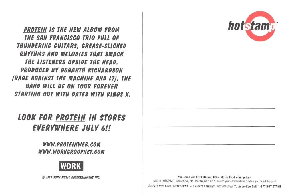
Protein Promotional Card
This card features a line illustration of a cow with dashed butchery style lines across the body. A band's name: "Protein" appears in stenciled lettering along the upper torso. A lemon is positioned in the animal’s mouth, creating a contrast between the livestock diagram and the unexpected fruit element. This type of illustration was often used in the late 1990s to create bold, simplified imagery for album or band promotion.
Protein, a San Francisco based rock trio active during the late 1990s. The description references producer Garth Richardson and highlights the band’s touring activity, including dates with Kings X. The card was distributed by the label Work Group under Sony Music Entertainment. Promotional postcards of this kind were common in retail outlets, clubs, and record stores at the time.
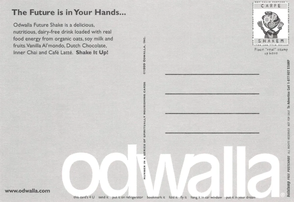
Odwalla Future Shake Card
The front of this card shows a stylized illustration of three abstract figures holding grain and beverage containers. The artwork uses bright colors and circular motifs that reference natural cycles. Phrases such as Shake up the future and soil to soul are incorporated into the layout. The design reflects late 1990s marketing that blended organic food themes with graphic symbolism.
The card advertises Odwalla Future Shake, a dairy free beverage line made with oats, soy milk, and fruit. Listed flavors include Vanilla Al mondo, Dutch Chocolate, Inner Chai, and Café Latte. The stamp area contains a printed illustration labeled Carpe Shakem. The card identifies itself as number one in a series of spiritually nourishing cards, a marketing approach Odwalla used during this period.
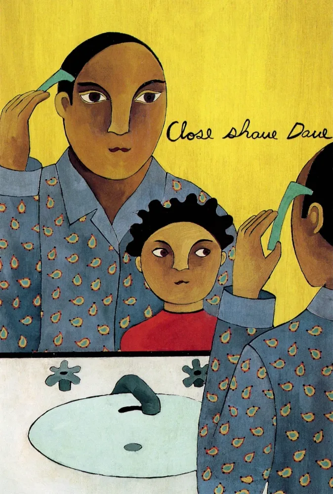
Close Shave Dave Card
This card presents an illustration depicting a person shaving while looking into a mirror, with a child visible in the reflection. The scene is rendered in a flat, stylized manner using muted colors and patterned clothing. The title Close Shave Dave appears in handwritten script. Artwork of this type was common in independent bookstores and art card series of the 1990s, often featuring everyday domestic scenes interpreted through contemporary illustration.
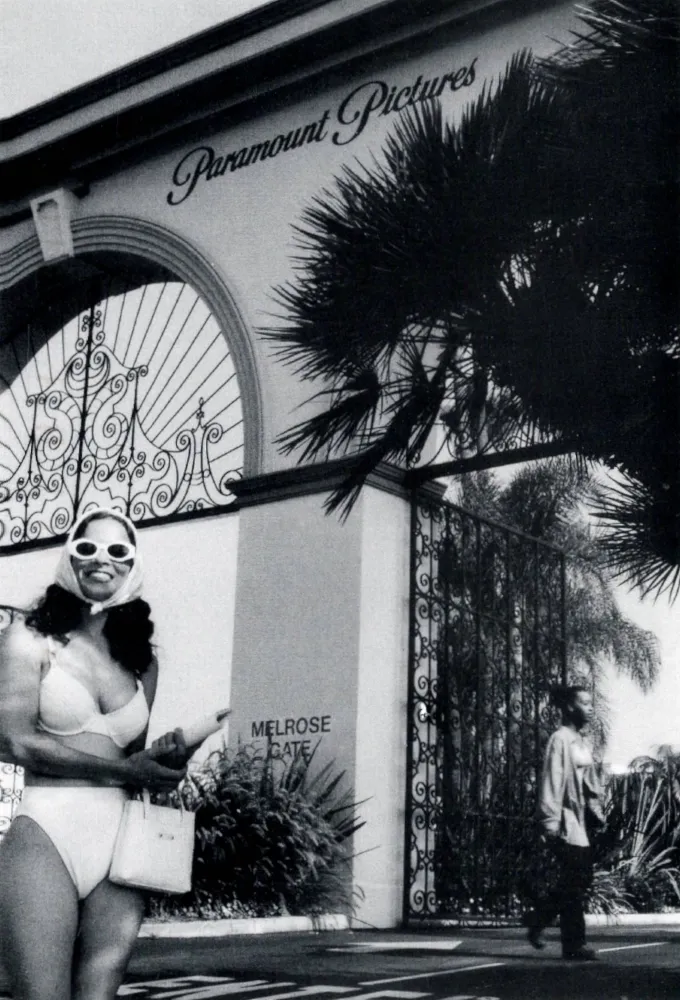
Paramount Pictures Melrose Gate Card
This black and white photograph shows the Melrose Gate entrance of Paramount Pictures in Los Angeles, with the signature ironwork arch and the Paramount Pictures sign above it. In the foreground, a person wearing a bathing suit, sunglasses, and a headscarf stands near the curb while another individual walks past the gate. This composition reflects candid street photography using a well known studio gateway as context.
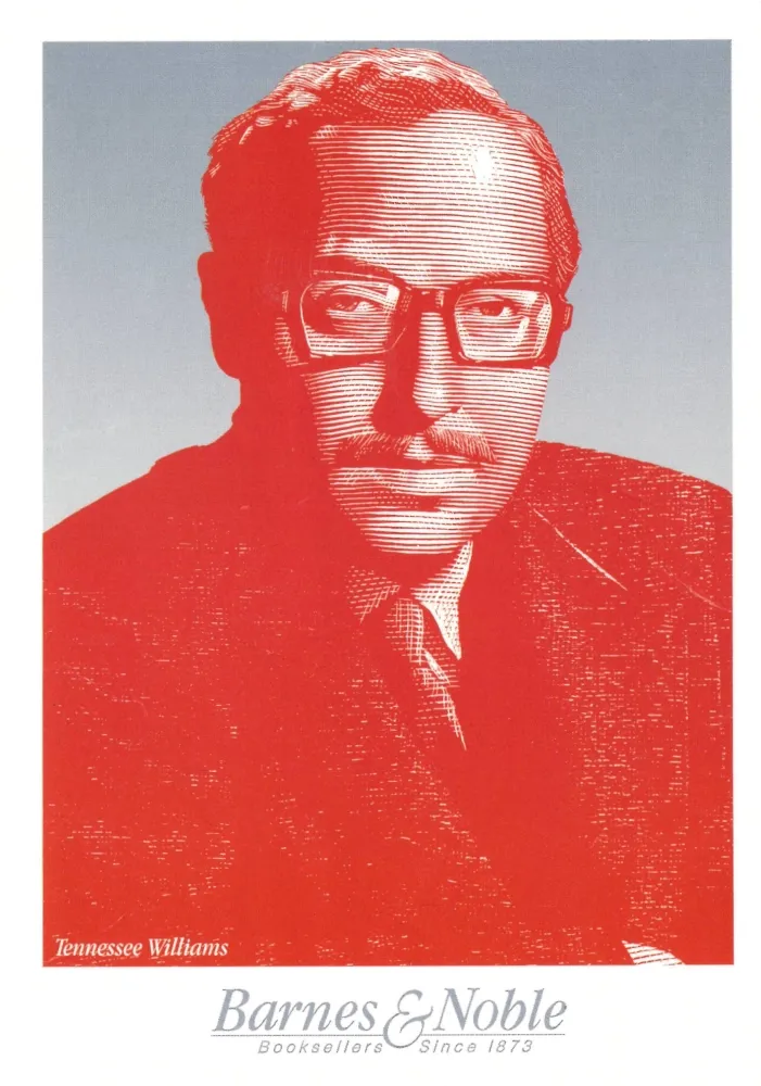

Barnes and Noble Tennessee Williams Card
This card features a stylized portrait of the writer Tennessee Williams rendered in red and white line work against a gradient background. The Barnes and Noble logo appears at the bottom, and was part of a promotional series highlighting notable literary figures. Retailers often produced author themed postcards during the 1990s for in store display and customer pickup.
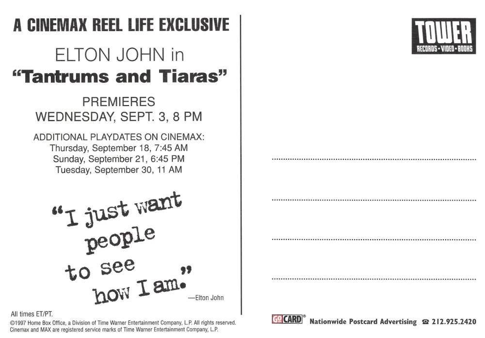
Elton John Tantrums and Tiaras Card
This promotional card advertises Tantrums and Tiaras, a documentary film about Elton John directed by David Furnish. The layout uses bold typography combined with repeated cropped photographs of Elton John’s face. The film was part of the Cinemax Reel Life documentary lineup.
The reverse lists premiere and replay dates on Cinemax. A quotation attributed to Elton John appears below the schedule. Branding for Tower Records is shown on the right side. Cards of this type were commonly distributed in record stores and entertainment venues to promote televised documentary releases.
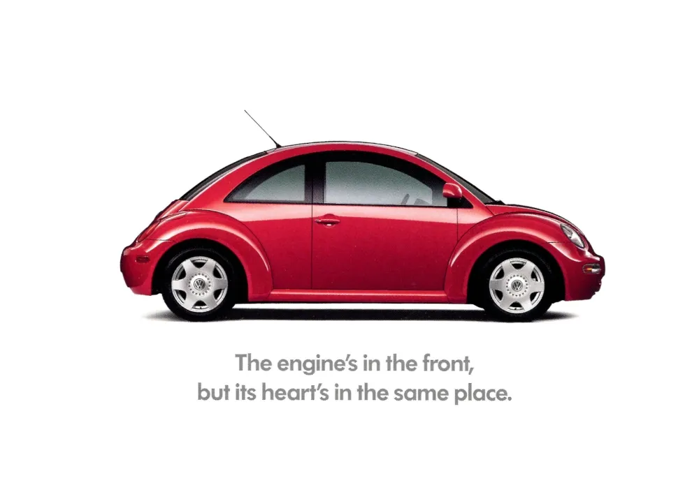
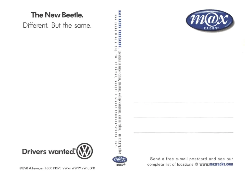
Volkswagen New Beetle Card
This card displays a side profile photograph of the new Volkswagen Beetle. The engine’s in the front, but its heart’s in the same place. The New Beetle, introduced in 1997, incorporated design elements recalling the original Volkswagen Beetle while using a modernized chassis layout. This postcard reflects the brand’s emphasis on nostalgia linked to updated engineering.
The reverse repeats the New Beetle slogan Different. But the same. and includes the Drivers wanted branding used by Volkswagen during this advertising period. Information about Max Racks postcard distribution locations is listed along the vertical margin.
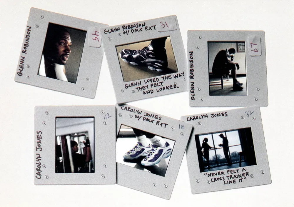
Athletic Shoe Promotional Slides Card
This card reproduces a set of photographic slides for a sneaker advertisement. The slides show athletes and athletic footwear, with handwritten labels referencing Glenn Robinson and Carolyn Jones along with the D Max RXT shoe model. The imagery combines product photography with lifestyle imagery typical of late 1990s athletic marketing. The handwritten notes imitate a design, or advertising proof sheet.
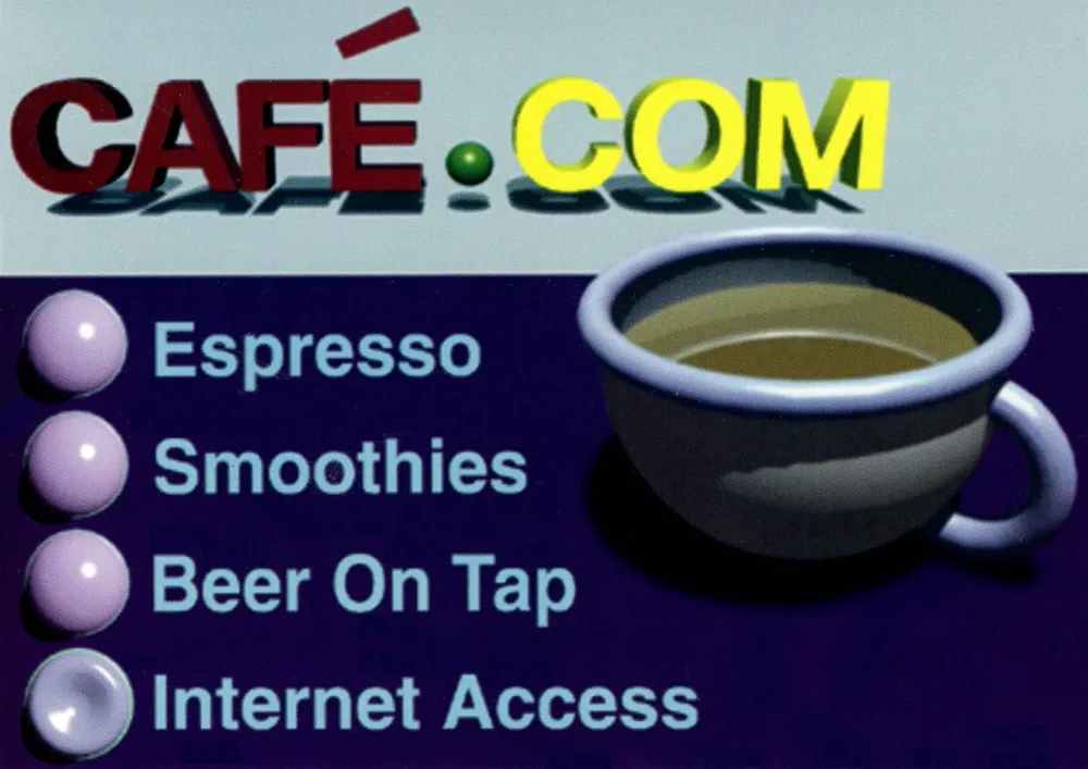
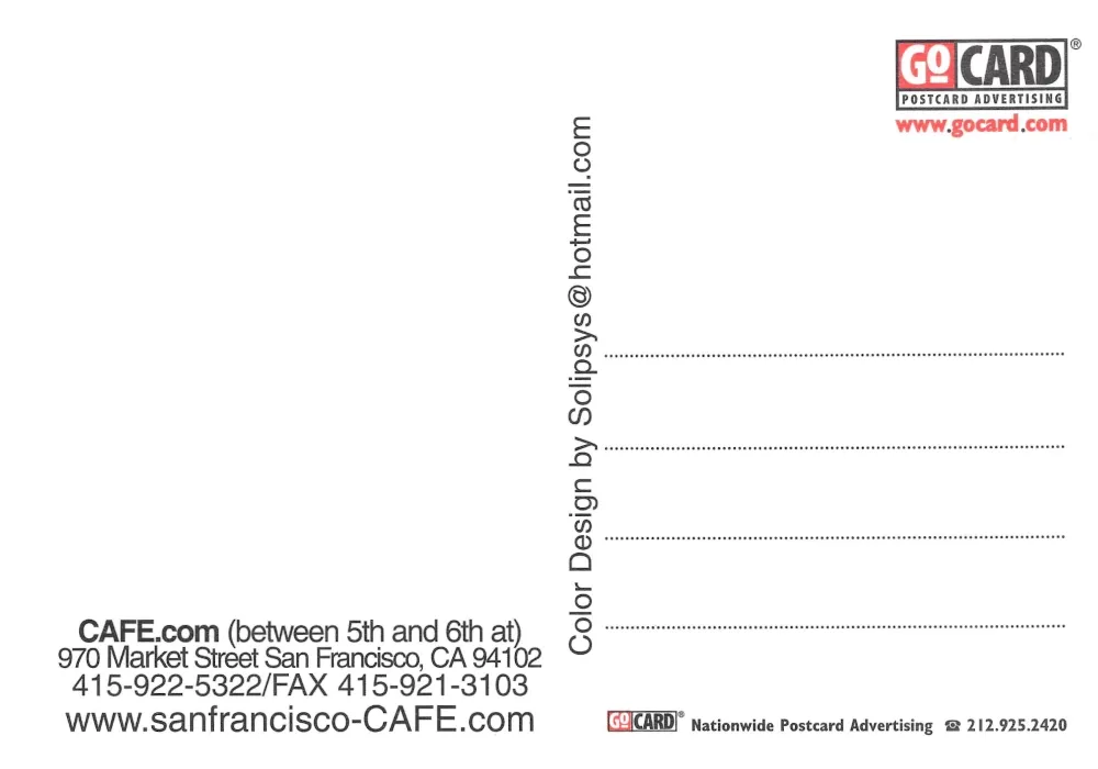
Cafe Dot Com Card
This card advertises Café Dot Com, using early internet era typography and design elements. This graphic features a stylized coffee cup along with a list of offerings including espresso, smoothies, beer on tap, and internet access. Establishments of this type were very popular in the late 1990s, and a trend in internet cafes that combined beverage service with dial-up public computer access.

Restaurant Florent Card
This card presents a series of small icon illustrations arranged across a kraft paper background. These icons identify the Restaurant Florent at 69 Gansevoort Street in New York. The layout reflects the minimalist graphic style used by many independent restaurants in the 1990s, emphasizing simple line drawings and utilitarian information such as hours of operation and contact number.
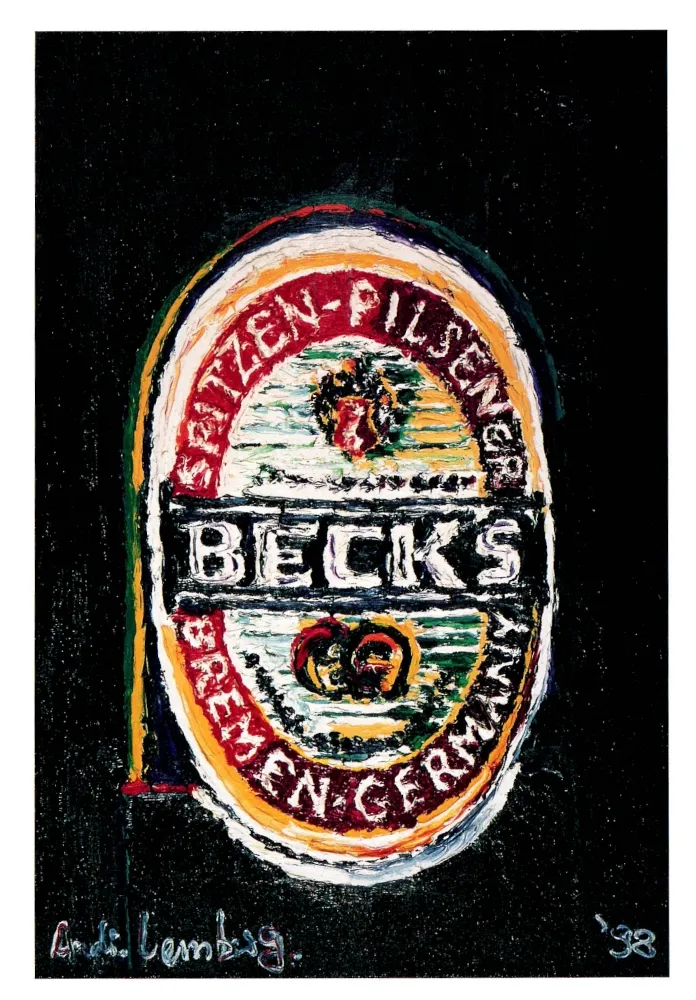
Beck’s Beer Label Painting Card
This card reproduces a painted interpretation of the Beck’s beer label, a German pilsner produced in Bremen. This artwork style uses thick brush strokes and a textured surface to re create the label’s recognizable oval shape and color scheme. The painter’s signature and date 98 appear at the bottom. Painted renderings of commercial logos were a popular motif during the late 1990s.
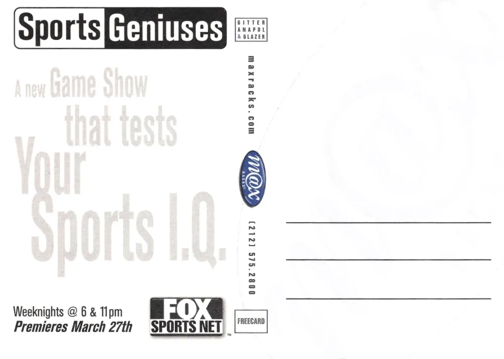
Sports Geniuses Card
This card displays an illustration of a human brain modified with baseball style stitching. The caption: "The average brain is mostly water. Yours is mostly Sports." This type of artwork was characteristic for sports themed advertising in the late 1990s, using anatomical graphics combined with humor to draw attention.
The reverse promotes Sports Geniuses, a game show aired on Fox Sports Net. The program’s show focused on testing sports knowledge and provided popular sporting events.
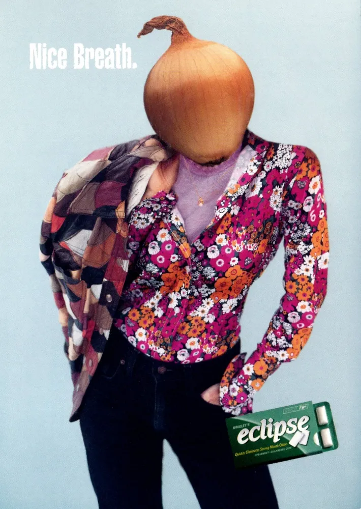
Eclipse Gum Onion Head Card
This card's photograph is of a person whose head has been replaced an onion, nice. The subject is dressed in 90's clothing against a plain background, again typical in the 90's. The phrase: "Nice Breath" also shows in the upper left corner. This postcard promotes Eclipse gum by Wrigley, using artistic humor.
The reverse describes the gum as sugar free gum to reduce strong breath odors. Additional Max Racks branding is also shown.
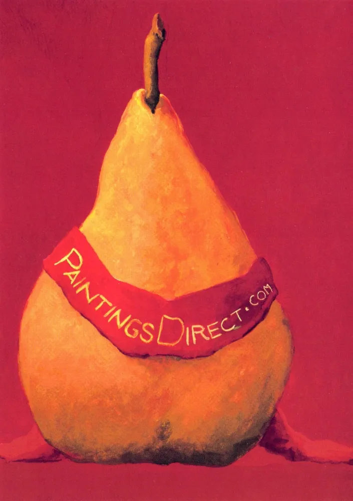
PaintingsDirect Pear Card
This postcard, with a large pear wearing a sash with PaintingsDirect.com wrapped around the fruit. The image appears as a logo for the online art retailer PaintingsDirect. The style is a contemporary painting with simple shapes and saturated color.
Back:
The reverse promotes original paintings by Marie Louise McHugh available for purchase through the PaintingsDirect website. The card references the shift in the late 1990s toward online platforms offering direct sales of artwork. The website still shows registered and active but the website appears to not be active.
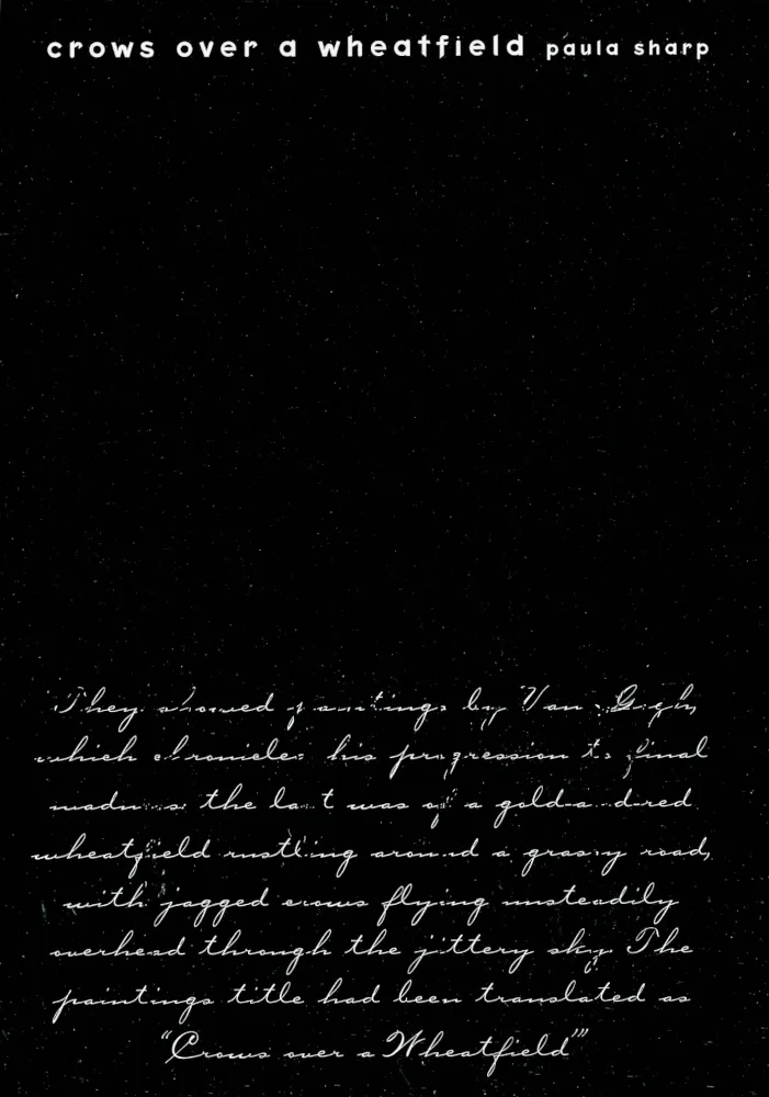

Crows Over a Wheatfield Card
This card features black background artwork accompanied by handwritten script referencing Vincent van Gogh’s painting Crows Over a Wheatfield. This describes the painting as part of a series that documented van Gogh’s final creative period. The layout appears to emphasize a reflective nature of the passage.
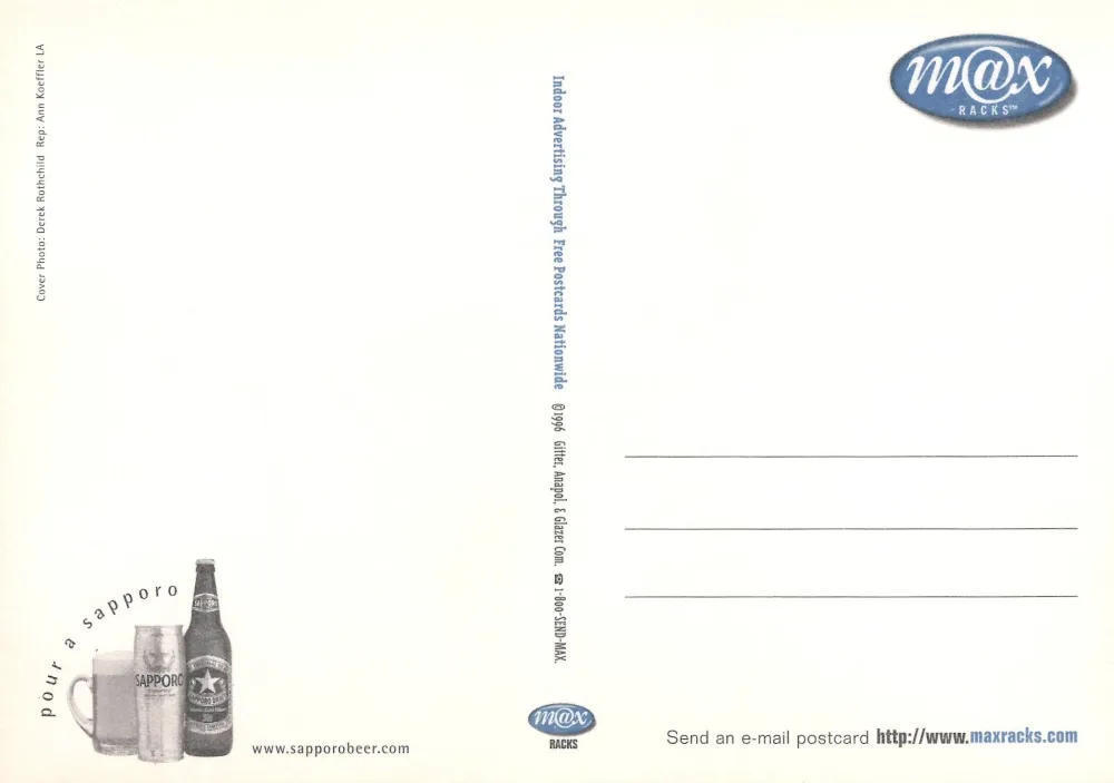
The reverse promotes Paula Sharp’s novel Crows Over a Wheatfield, describing it as a fusion of personal and political themes. A testimonial from author Elizabeth Berg is included. Another Max Racks branding postcard.
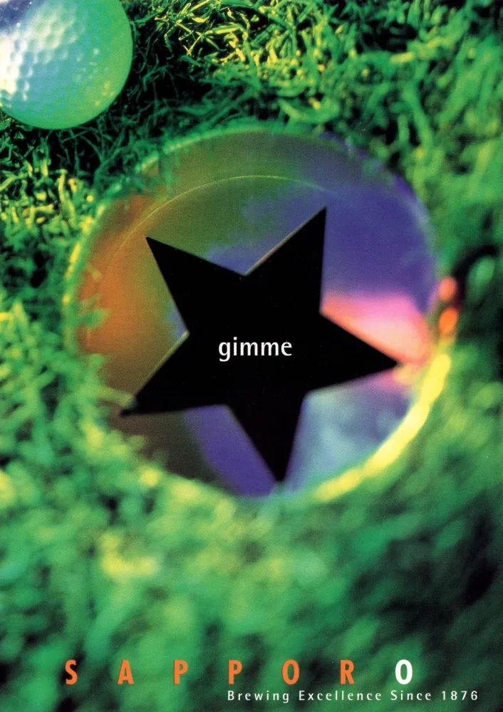
Sapporo Beer Golf Themed Card
This card displays a close up photograph of a golf ball resting on grass near a star shaped metal marker engraved with the word gimme. This postcard promotes Sapporo beer branding at the bottom, referencing the brewery’s founding year of 1876.
The reverse includes a product lineup image of Sapporo beer in bottles and glasses. Standard Max Racks contact information is also listed. An advertising campaign connecting alcoholic beverages with leisure and outdoor recreation.
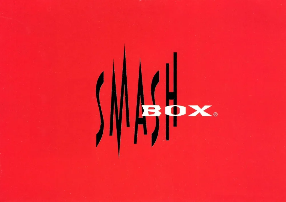
Smashbox Cosmetics Card
This card presents the Smashbox Cosmetics company's logo with black and white lettering with red background. The logo is their distinctive appearance, consistent with the Smashbox visual identity in the 1990s. Smashbox was created by the great-grandson of Max factor, using humane ingredients that did not use animals for testing, at least until he sold the company to Estée Lauder in 2006.
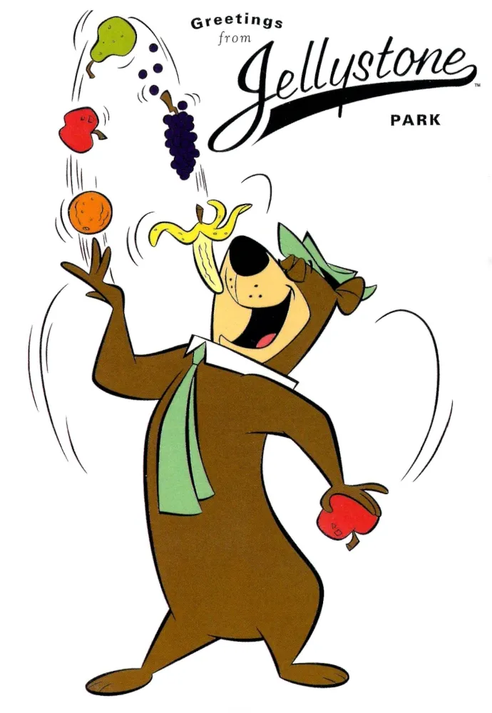
Yogi Bear Jellystone Park Card
This is my favorite postcard in this series. The postcard features the animated character Yogi Bear juggling various fruits, with the caption Greetings from Jellystone Park. The character design follows the traditional Hanna Barbera style with clean outlines and flat color fields. Jellystone Park is the fictional campground setting where Yogi Bear lives.
The reverse includes the ownership and trademark notices for Yogi Bear and their related characters. A faint background image of Yogi Bear is shown behind the writing area. The card was produced by Penrod Hiawatha, a publisher known for licensed cartoon postcards.
For fans and Parents:
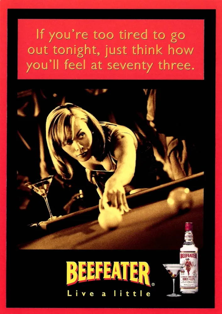
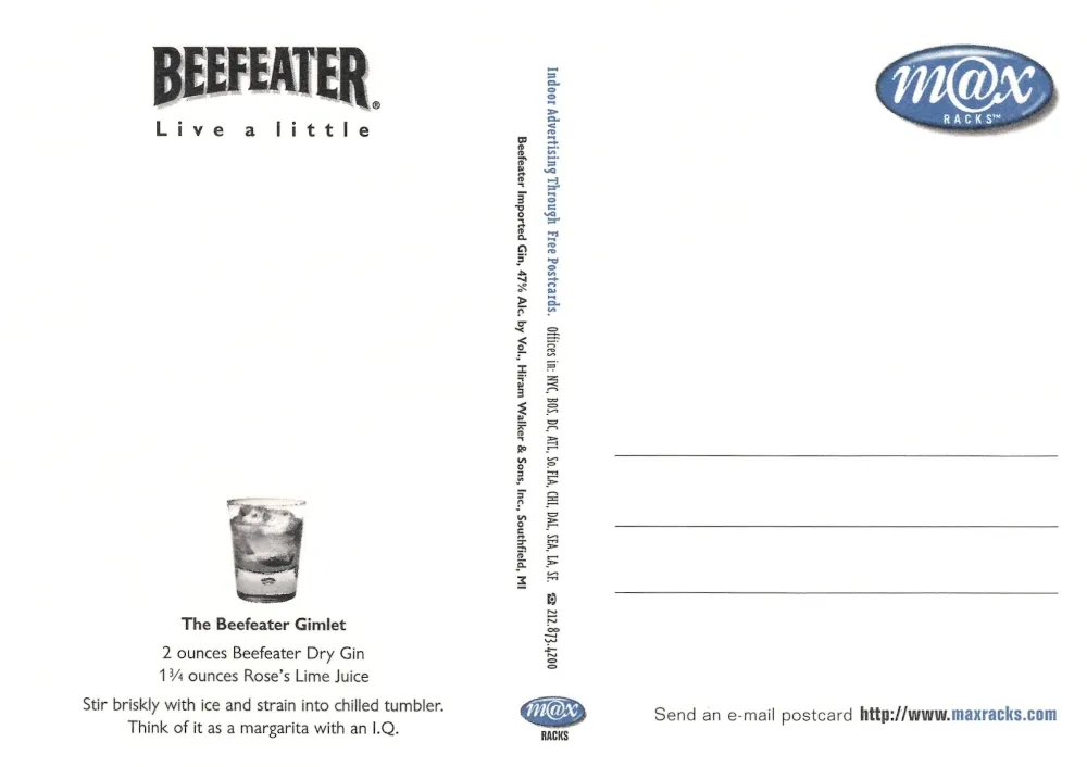
Beefeater Gin Live a Little Card
This postcard shows a nightclub scene with a woman learning how to play pool, reaching toward a cue ball. The photograph has nice sepia tones. The phrase: "If you’re too tired to go out tonight, just think how you’ll feel at seventy three". Beefeater branding is at the bottom along with the tagline: "Live a little". This postcard reflects 1990s advertising trends that associated spirits with nightlife environments, which is still common to this day.
The reverse features a nice recipe for the Beefeater Gimlet cocktail, listing proportions of Beefeater Dry Gin and Rose’s Lime Juice. The layout includes Max Racks distribution markings and standard postcard addressing lines.
Spirits companies commonly used recipe based postcards in the 1990s to encourage sales and to use their products for cocktails and drinks.
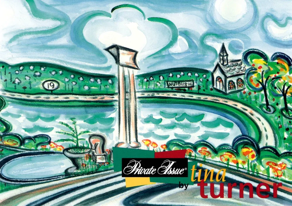
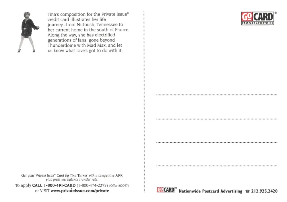
Private Issue by Tina Turner Card
This card presents a cool 90's style landscape illustration associated with the Private Issue credit card campaign featuring Tina Turner. The artwork includes rolling hills, water, a roadway, and small architectural structures. The word Nutbush references Nutbush, Tennessee, where Tina Turner was born. The illustration is typical of commercial art from the period.
The reverse explains that the illustration represents Tina Turner’s life journey, from Nutbush to her residence in the south of France. It mentions her cultural impact as a performer and references her role in Max Max Beyond Thunderdome. The card also includes application information for the Private Issue credit card and GoCard advertising.
Closing Reflection
As this forth volume comes to an end, the collection continues, one postcard at a time. Many of these have traveled through years of handling, storage, and movement across cities, and some arrived worn or faded from age. Restoring them takes time, but the effort allows each card to be seen close to as it once was, preserving details that might otherwise be lost. Sharing them in this format hopefully gives a refreshed clarity and allows these stories and meanings to remain visible.
More postcards are still being worked on, scanned, edited in GIMP and to be added to the Postcard series. Each restored image adds to the larger narrative of this 1990's time capsule, and the next volume will continue to build on this growing archive of life on the road and the culture that surrounded it.

Volume I

Volume II
Volume III